Light Spring: The Sun-Drenched Palette. A Guide to Curating a Glowing Light Spring Wardrobe
In the 12-season color analysis system, Light Spring (sometimes called “Fair Spring”) is the sub-season characterized by a delicate, sunny, and ethereal appearance. It sits between True Spring and Light Summer, meaning it is primarily defined by its low depth and high brightness.
Low Depth
In the context of color analysis, Depth (also referred to as Value) describes how light or dark a color is. It is measured on a scale from pure white to pure black.
When analyzing your personal coloring, depth is used to determine where you sit on the spectrum of “Light” versus “Dark.”
- High Depth (Dark/Deep): These colors contain a lot of black pigment. Think of chocolate brown, forest green, navy, or charcoal. People with high depth (like Deep Autumn or Deep Winter) usually have dark hair and eyes that create a striking contrast against their skin.
- Low Depth (Light): These colors contain a lot of white pigment, often referred to as pastels or tints. Examples include mint green, lavender, and sky blue. People with low depth (like Light Spring or Light Summer) have a delicate, “airy” look with very little darkness in their features.
The Role of Brightness (Chroma)
In color analysis, Light Spring is the “purest” and lightest expression of the Spring family. When we talk about “brightness” in this specific season, we are referring to Chroma (saturation) and how it interacts with the light value of the palette.
In the Light Spring palette, brightness is high, but it is not “neon” or “electric.” Instead, it is better described as clarity.
- Clarity over Mutedness: Light Spring colors are never dusty, grayish, or muddy. They have a clear, “true” pigment. If you imagine a drop of bright paint mixed into a large bucket of white paint, the resulting color is clear and light, rather than desaturated by gray.
- The “Luminous” Quality: Because Light Spring sits on the edge of the Summer season, it loses some of the intense “punch” seen in True Spring or Bright Spring. Its brightness manifests as a radiant, glowing quality rather than a sharp, high-contrast one.
Key Dimensions of a Light Spring
To be a Light Spring, your features must align with these three specific qualities, in order of importance:
- Primary Feature: Light. Your overall coloring is low-contrast and delicate. There is very little “weight” or darkness in your hair, skin, or eyes.
- Secondary Feature: Warm. You have distinct yellow or golden undertones, though they are less intense than those of a True Spring.
- Tertiary Feature: Bright. Your colors are clear and saturated rather than muted or “dusty,” but because they are so light, they appear pastel and glowing.
Physical Characteristics
- Eyes: Usually light blue, green, hazel, or light aqua. They often have a “sunburst” pattern around the pupil or a clear, glass-like quality.
- Skin: Very fair with warm undertones. It may have a porcelain quality or light golden freckles. It typically burns easily rather than tanning deeply.
- Hair: Light to medium golden blonde, strawberry blonde, or “dirty” blonde with golden highlights.
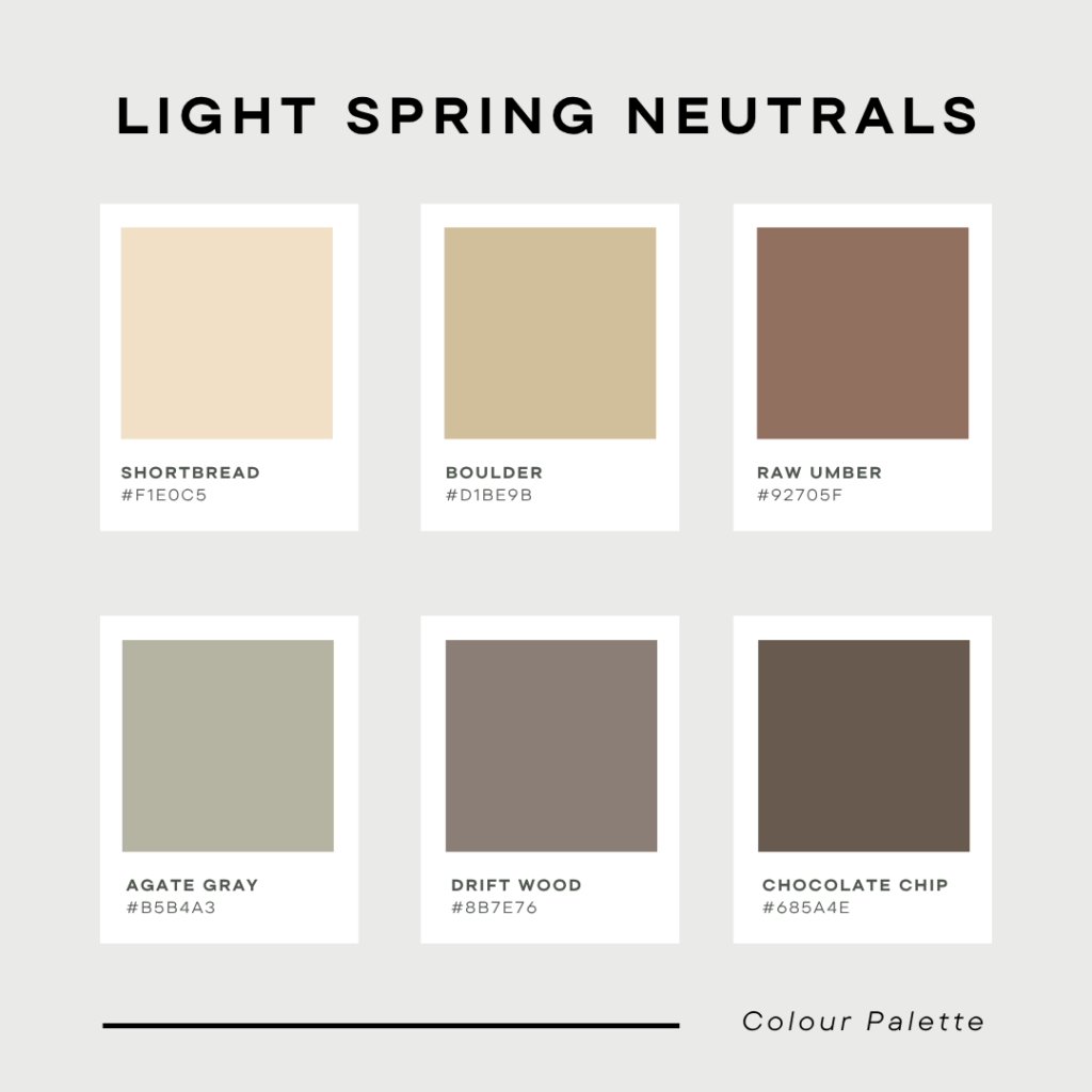
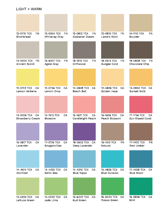
The Color Palette
The Light Spring palette looks like a garden in the early morning sun. It borrows some of the coolness from Light Summer but keeps the golden “glow” of Spring.
| Category | Best Colors |
| Neutrals | Champagne, light camel, soft sand, and warm dove grey. |
| Pinks & Reds | Peach, apricot, salmon, and light coral. |
| Blues & Greens | Mint, aqua, turquoise, and light periwinkle. |
| Yellows | Daffodil, chiffon, and soft butter yellow. |
What to Avoid
- Black and Dark Navy: These colors are too heavy and will “wash out” a Light Spring, making them look tired.
- Dark, Moody Colors: Deep burgundies, forest greens, or chocolate browns overwhelm the delicate natural coloring.
- Neon or Harsh Brights: While Light Spring is “bright,” colors that are too neon (like electric lime) can look “tacky” or aggressive against such fair features.
Styling Tip
When building a wardrobe for this season, aim for low-contrast outfits. Instead of pairing a light top with a dark bottom, try pairing a peach top with light khaki trousers. This mimics the natural low contrast of your physical features and creates a harmonious, “glowing” look.
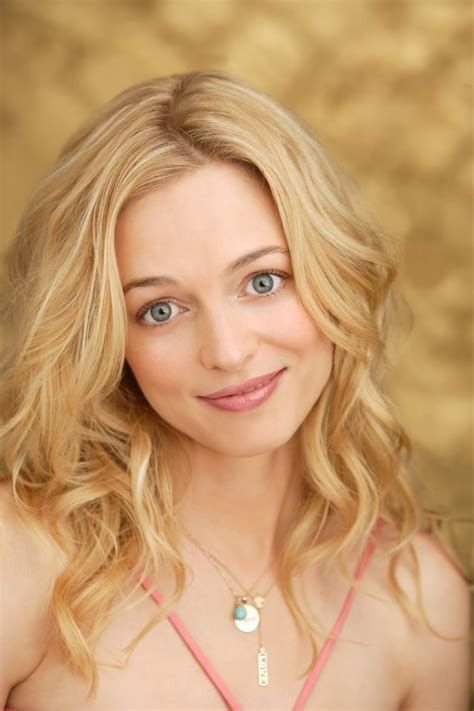
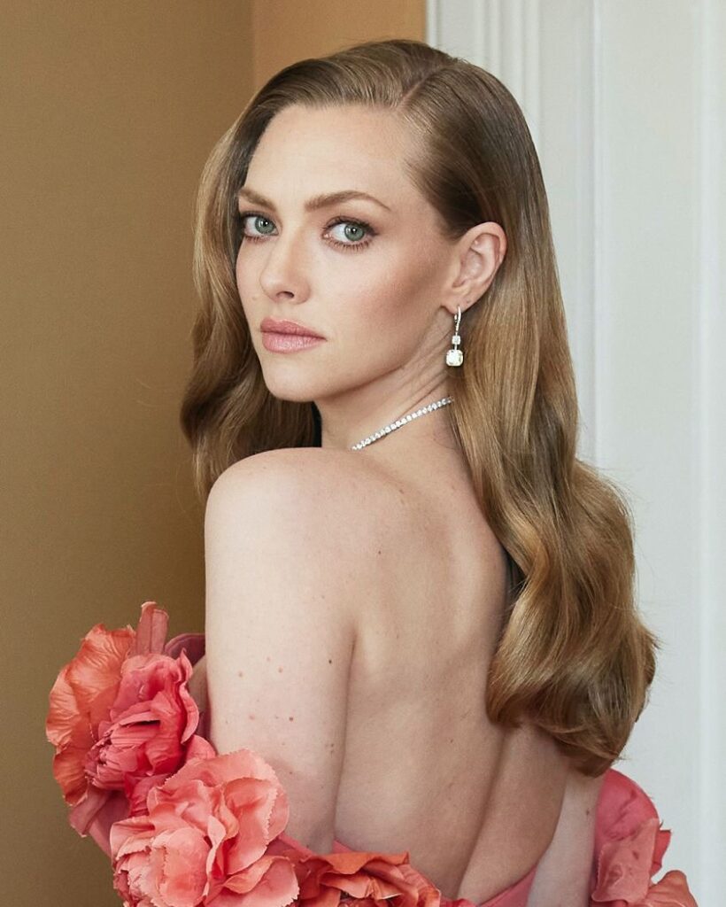
Celebrity Examples
Heather Graham
Amanda Seyfried
Outfit Color Ideas
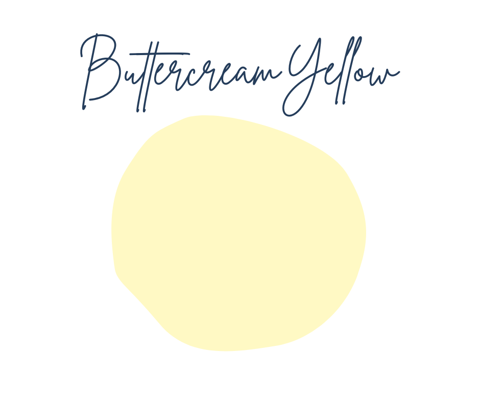
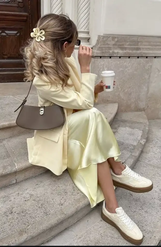
Light and Clear Pastel Yellow
The outfit, hair, and overall aesthetic of this image are an excellent representation of a Light Spring color season.
HEX CODE: #FFF9C4
Here is a breakdown of why this look fits the “Light Spring” profile so perfectly and which elements connect to that season.
1. The Dominant Feature: Light Value
As noted in the description, the primary characteristic of Light Spring is Light Value. This entire look is built on light, delicate colors rather than deep or medium-toned ones.
- The Clothing: The creamy, soft yellow (almost vanilla) of the blazer, the buttery satin of the dress, and the off-white sneakers are all from the highest value end of the color spectrum. They are light, but they contain crucial warmth.
- The Hair: Her hair is a very light golden blonde—a common “Light Spring” hair color.
2. The Luminous and Warm Undertone
A key distinguishing feature of Light Spring is a yellow (warm) undertone. This look is decidedly warm.
- Warmth: Every item has a warm, golden, or creamy base. There are no icy or grayish undertones here. Even the brown handbag has a warm, taupe tone, not a cool slate or espresso.
- Luminosity: This is where the satin dress shines. That luminous, glowing quality is a hallmark of the Light Spring palette. It creates radiance. A “muted” season (like Autumn) would use a matte version of this yellow, but Light Spring thrives with this reflective texture.
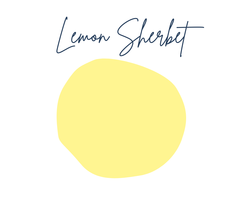
Light and Bright Pastel Yellow
This image is an example of a yellow outfit for a Light Spring, but it leans slightly further into the “Spring” side of the palette, due to it’s saturation. It captures the essence of clarity and warmth perfectly.
Hex Code: #FFF591
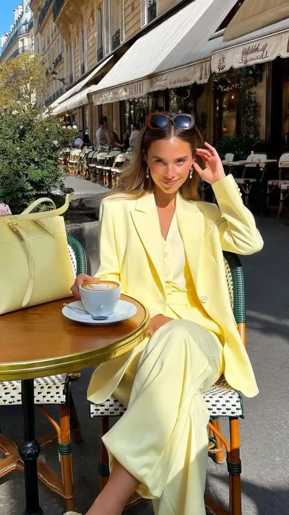
Here is how this look breaks down through the lens of a Light Spring analysis:
1. Elevated Saturation (Chroma)
While the previous image was very “creamy,” this yellow is a bit more pigmented—often called “Sherbet” or “Sunshine Yellow.”
- Clarity: This color is clear and bright without being neon. It has that “pure” pigment quality we discussed earlier, rather than a muted or “dusty” tone.
- Luminosity: The monochromatic styling (yellow on yellow) creates a radiant, glowing effect that reflects light onto the skin, which is a key goal for this season.
2. High Value (Lightness)
The outfit remains firmly in the light value category.
- Weight: Even though it is a full suit, the color keeps it feeling airy and delicate.
- Contrast: Notice the low contrast between her skin, hair, and clothing. A Light Spring’s features are often delicate, and this “wash” of light color supports that rather than overwhelming it.
3. The “Spring” Neutrals
The accessories provide a great lesson in Light Spring neutrals:
The Sunglasses: These are a warm, tortoise-shell brown. This is the ideal “dark” neutral for a Light Spring because it provides definition without the harshness of black.
The Bag: It perfectly matches the suit, maintaining that low-contrast, high-clarity look.
The Clothing: The creamy, soft yellow (almost vanilla) of the blazer, the buttery satin of the dress, and the off-white sneakers are all from the highest value end of the color spectrum. They are light, but they contain crucial warmth.
Warmth: Every item has a warm, golden, or creamy base. There are no icy or grayish undertones here. Even the brown handbag has a warm, taupe tone, not a cool slate or espresso.
Luminosity: This is where the satin dress shines. That luminous, glowing quality is a hallmark of the Light Spring palette. It creates radiance. A “muted” season (like Autumn) would use a matte version of this yellow, but Light Spring thrives with this reflective texture.
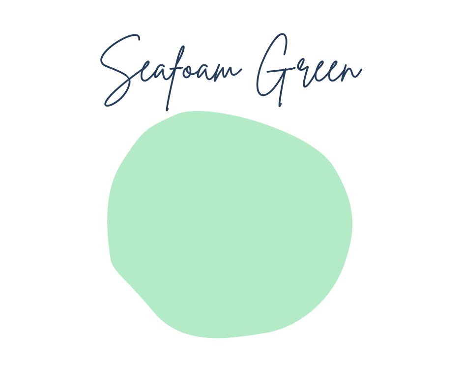
Seafoam Green
This pale, seafoam green is an excellent representation of the Light Spring palette because it is warmer than icy or minty green alternatives and it is light and clear. It hits nearly every key characteristic we’ve discussed for this color season.
Hex Code: #B2EBC5
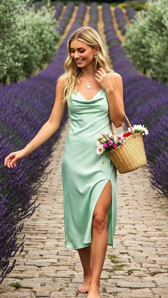
Why this is a Light Spring look:
- Dominant Light Value: The dress is a pale, seafoam green that sits at a very high value (lightness). Light Spring is primarily defined by these light, airy colors.
- Warm-Neutral Hue: This specific shade of green has a clear yellow undertone. It avoids the “icy” or minty coolness of a Summer palette, maintaining the warmth necessary for a Spring.
- Luminous Texture: The satin fabric provides a glowing, reflective quality. This “luminosity” is a hallmark of the Light Spring season, as it mimics the radiant, clear quality of the skin.
- Low Contrast Styling: The model has golden blonde hair and a clear complexion, creating a low-to-medium contrast with the dress. This harmonious, “washed in light” effect is exactly what a Light Spring aims for.
- Warm Accessories: The gold jewelry and the straw basket provide warm, natural textures that ground the outfit without adding the “heaviness” or harshness of dark colors or black.
Comparison to other seasons:
- Not Light Summer: While Light Summer is also very light, its greens would be more “watery” or bluish-toned. This dress is too “sunny” and warm for Summer.
- Not Soft Autumn: This color is far too clear and bright for an Autumn. A Soft Autumn green would be much more muted, sage-like, or “dusty”.
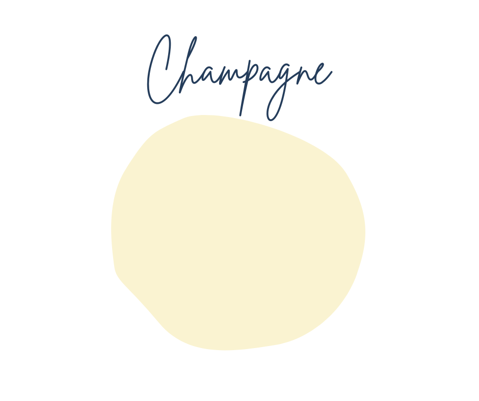
Champagne Gold
This outfit leans more toward Light Spring than other seasons, but it sits on a bit of a glamorous fence.
Hex Code: #FAF3D1
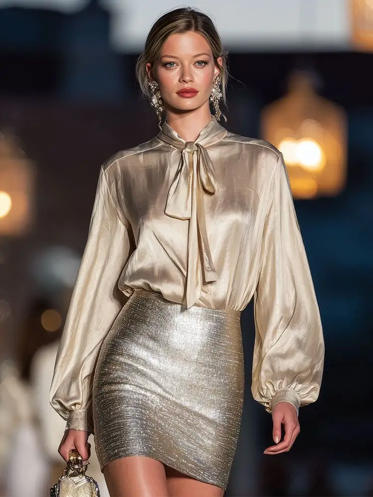
Here is a breakdown of how these pieces align with the Light Spring palette:
The Color Breakdown
- The Blouse: This champagne or “clover honey” shade is a classic Light Spring neutral. It is warm, light, and delicate, which suits the palette’s need for “glow” rather than “heavy” warmth.
- The Skirt: The metallic gold is excellent. Light Springs shine in light, bright golds and champagnes. However, because this is a very high-shine, reflective gold, it also flirts with True Spring or Light Summer (if the gold were more of a pale “white gold”).
- The Contrast: Light Spring looks best in low-to-medium contrast. This monochromatic gold-on-gold look perfectly maintains that soft, harmonious transition that won’t overwhelm a Light Spring’s delicate coloring.
Why it works for Light Spring
Light Springs are defined by being Light first and Warm second. Because both the top and bottom are very high-value (meaning they are light in color) and have a warm undertone, they hit the primary requirements for the season.
A Small Caveat
The fabric texture is very high-shine. While the colors are Light Spring, the intensity of the shine can sometimes lean into Bright Spring territory. For a quintessential Light Spring look, you might pair that blouse with a matte cream trouser or a softer, less “liquid” metallic skirt to keep the focus on the softness of the season.
Overall, it’s a stunning choice for someone in that palette looking for a high-glamour, evening version of their colors!
Soft Warm Apricot
The dress is a soft, warm apricot or light peach, which is often considered a “power color” for this season.
Hex Code: #FFB28E
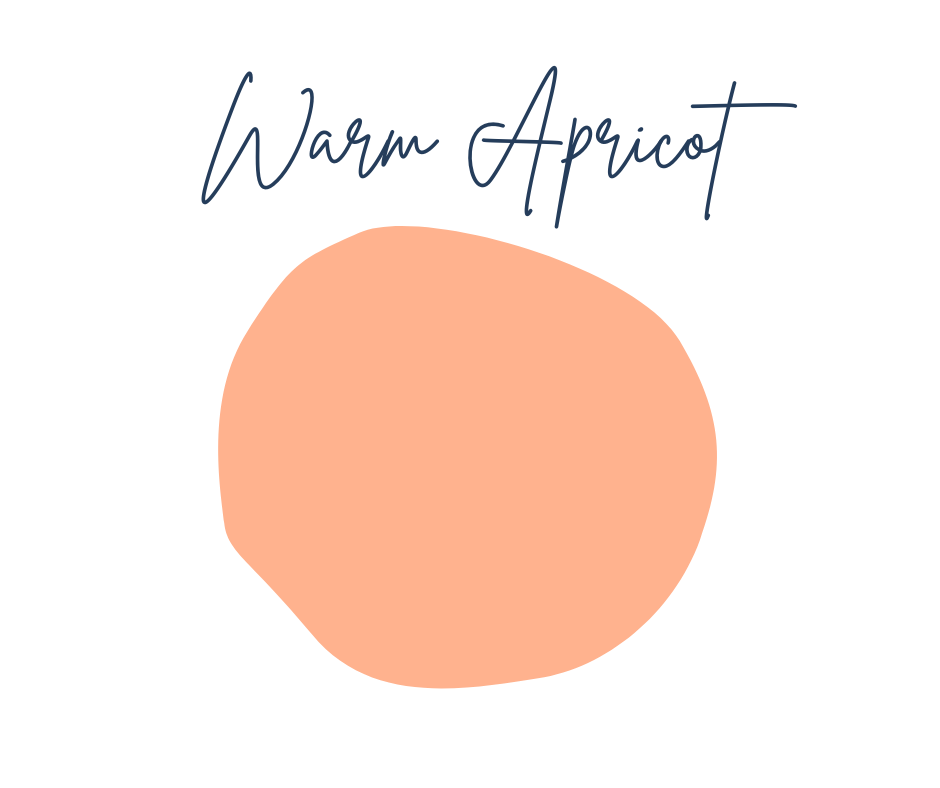
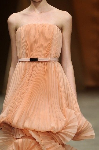
It perfectly embodies the three main characteristics of the Light Spring palette:
- Lightness: The color is high-value and airy, meaning it won’t overwhelm a delicate complexion.
- Warmth: It has a clear yellow/orange undertone, providing that “sun-drenched” glow rather than a cool or icy one.
- Clarity: The color is relatively clear and fresh, not “muddy” or overly muted.
Concluding Thoughts
Embracing a Light Spring palette is all about capturing that specific moment when the world first begins to wake up—full of clarity, warmth, and a delicate, sun-drenched glow. By shifting away from heavy, muted tones and toward the airy peaches, champagnes, and primrose yellows that define this season, you aren’t just changing your clothes; you are aligning your physical space with a sense of intentional, conscious curation.
Whether you’re drawn to the ethereal shimmer of a champagne silk blouse or the organic warmth of an apricot pleated dress, the key is to prioritize lightness and warmth in every piece. Remember that building a wardrobe is a journey of refinement. Start by batching your shopping or styling tasks to focus on these harmonious shades, ensuring that every new addition feels like a natural extension of your personal aesthetic.
As you continue to curate your style, let these colors serve as a tool for self-expression that feels both grounded and high-glamour.