Choosing A Shade of Red For Your Nails Colour Based on Your Colour Season
Before I start, the first disclaimer I should make is that most seasons don’t really have something that you’d call a “red”. It’s really just the three winters and bright spring that get a colour you could call a “red”. But don’t worry, I’ll cover every season and the best alternatives to a “true” red. I blab on about writing this blog for a bit and so if you want you can skip ahead to the colour season science click here (no offence taken). If the science is also not really your jam, skip to the pretty pictures here. At the end of the day, they’re just nails, so if you’re not “supposed to” wear red with your colour season, but you want to: be naughty! Do it!
I would like to start this post with what I think is a funny story. Now, I know AI spits out some absolute garbage and writes some intolerable to read slop text, but in my ignorance I assumed that for mathematical equations and basically anything with an objective answer – she good. And color season analysis is a science. There are mathematical equations that can be executed to find exact the midpoints within a colour season and therefore find their mathematical best colour. There are also discrete, objective category boundaries as to whether a colour does, or does not fall within the parameters of a colour season. And in the grand scheme of things, the mathematics behind astrophysics is surely a little more complicated than that of colour season analysis, no? So here’s what happened. I painstakingly went through each colour season with Gemini to find the best red, and made little swatches of the colours in Canva to give readers a visual representation of the colour. Then I came back with the idea to go through the OPI nail colours to see which actual colours from OPI I could allocate to each colour season according to their approximate hex code. So far so good. So Gemini gives me the hex codes and the colours. But hang on, some of those really don’t look right. So I questioned it: it confesses: it’s giving me slop. It admits it has categorized some of these colours in the wrong season. So then I’m thinking – better double check the hex codes it gave me for the colour swatches I made. So what does it tell me? That they are not correct for their season and unfortunately fashion blogs can use definitive language with inaccurate data. Gemini, it wasn’t a fashion blog I got the data from, it was YOU!
So here we are, if you’re reading this today (June 13, 2026), some of the colours I used as examples are wrong 🙁 But! Just know I am doing my best to make sure the colour information doesn’t just look right subjectively, but that it’s mathematically accurate, based on the exact parameters of your season. Readers: it is a labor of love!
If you don’t know your colour season, you can take the quiz here: colour season quiz.
OK, thanks for your patience, on to the colours. Not interested in the science? Skip to the nails here.
So lets start with the most basic question. What is red? Is there an exact hex code for the reddest of red?
The science:
TL;DR: reds on screens and reds on hands are different. There is no scientific boundary for when a colour is no longer a red!
Red is a primary color in the additive (light) and subtractive (pigment) color models. It is the color at the long-wavelength end of the visible spectrum, typically associated with wavelengths between approximately 625 and 740 nanometers.
The Boundary Problem
However, apparently “There is no hard “hex” line where red becomes brown” or pink, purple, orange, etc. This makes it SUPER tricky to create a “red nail” post, as some seasons don’t even have red as one of their wearable colours. Surely I still can’t call “coral” a “red”?
I guess this explains many a debate about whether that’s a “dark navy” or a “black” pair of trousers!
Is there an “exact” reddest red?
The answer depends on the medium. Because digital screens and physical pigments operate differently, there is no single universal “reddest” hex code (bummer).
1. In Digital Color (sRGB)
The standard digital color system used by most web browsers and monitors is sRGB (Standard Red Green Blue). The “purest” red is defined by turning the red channel to its maximum value (255) and keeping green and blue at zero. It looks like this:
- Hex Code:
#FF0000 - RGB:
(255, 0, 0)
On a digital monitor you cannot get “redder” than this because the hardware cannot emit a more intense signal for the red sub-pixels.
However, this is not necessarily perceptually the reddest red.
The Truest Red Nail
Applying the theoretical analysis of “red” to nail polish, means moving away from the application of additive light (the #FF0000 emitted by your phone screen) systems. How “red’ a nail colour is relates to the colour’s subtractive pigments and light refraction.
The Psychological Primary (NCS)
The Natural Color System (NCS) defines red not by light mixing (RGB) but by human perception.
- The Theory: It defines “psychological primary red”—a red that is “neither yellowish nor bluish.”
- The Hex Approximation: Because screens can’t perfectly replicate this perceptual ideal, we use approximations like
#C40234. This color is often perceived as “more red” than the digital “electric red” (#FF0000) because it feels more stable and natural to our eyes, avoiding the neon/orange cast that pure digital red often has.
So, we can see there’s already a problem with establishing exact hex codes for use on monitors when there is such a distinct difference between the “truest” sRGB red and the “truest” NCS red.
The “Reddest” Nail Polish Red
For nail polish colours, the “reddest” red isn’t determined by the hex code, but by how the pigment particles absorb and reflect light. Here is how we break that down:
1. The “True Red” Pigment Problem
TL;DR: The “purest” red is achieved by perfectly balancing pigments to neutralize yellow or blue undertones, ensuring the polish reflects only pure red light without shifting toward orange or cool-toned berry shades.
In physics, to get the “reddest” red, you need to subtract all other wavelengths (blue, green, yellow) and reflect only the long-wavelength red light.
- The Challenge: Most red pigments are not perfectly efficient. They often reflect a tiny amount of yellow (making the polish lean “orange-red”) or a tiny amount of blue (making the polish lean “cool-toned” or “berry-red”).
- The “Purest” Red: A nail polish that appears the “reddest” to the human eye is usually one that is perfectly balanced—it contains enough blue to cancel out any orange undertones, but not enough to push it into the territory of a “cool” or “cherry” red.
2. Why “Reddest” Depends on the Finish
TL;DR: Crème polishes offer the most solid, opaque red, jellies create a rich, “lit-from-within” depth, and metallics prioritize bright, desaturated reflections over color purity.
When you move from theory to reality, the finish changes how our eyes perceive the intensity of the color:
- The Crème Finish (The Most “True” Red): A high-quality, opaque crème polish is the closest physical approximation to the mathematical definition of red. Because it is highly pigmented and absorbs light consistently, it provides the most “solid” block of red color. This is where you get those iconic, classic Hollywood reds.
- The Jelly/Sheer Finish (The “Depth” Red): Jellies have less pigment density. When you layer them, they create depth. Paradoxically, a layered jelly can sometimes look “redder” than a crème because the light passes through the layers, hits the nail plate, and reflects back out, creating a “lit-from-within” glow that a flat, opaque crème cannot achieve.
- The Metallic/Cat-Eye/Chrome Effect: These do not represent “true” red in the same way because they use reflective particles (like mica or magnetic metallic pigments). These add specular highlights—they bounce bright white light off the surface. While they are beautiful, the white reflection technically desaturates the red color, making them appear “bright” rather than “purely red.
Ok, so now that I’ve made the question “what is red” clear as mud for you, lets look at colour seasons to see which seasons have red in them.
Now we’re going to REALLY nerd out, I’ll put another skip ahead link here.
The Coordinate System: CIE L*a*b*
To move from “subjective opinion” to “objective science,” professional analysts use the CIE L*a*b* color space. This is the mathematical “map” where every color has a specific coordinate:
- L* (Lightness): Matches the Munsell Value.
- a* (Red/Green axis): Positive values are red, negative are green.
- b* (Yellow/Blue axis): Positive values are yellow, negative are blue.
Mathematically, a seasonal palette is simply a “bounded region” within this 3D coordinate system. For example, a “True Winter” palette is mathematically defined by high L* contrast, a blue-biased b* coordinate, and high chroma saturation.
Measuring Harmony: ΔE (Delta E)
The most important “math” in color science for stylists is ΔE (Delta E). This is a metric that calculates the “perceptual distance” between two colors.
If you take a sample of your skin and a sample of a red fabric, you can calculate the ΔE between them.
The Math:
*(Includes additional weighting factors for hue and chroma)*
The Application:
If the ΔE is low, the color is “harmonious” with your skin. If the ΔE is high, the color “clashes.” This is how color analysts scientifically verify that a specific red truly “belongs” to a specific season.
So basically, in color theory: It is not about any one dimension; it is about the “Total Distance” (the ΔE).
The “Interaction” Rule
The three dimensions (Value, Hue, Chroma) balance each other out.
This is why you can sometimes “get away” with wearing a color that isn’t perfectly on-palette, while other times a color that seems “close” looks completely wrong.
- The “Trade-off” Effect: If a color has a slightly “off” hue (e.g., a bit too cool for an Autumn), but its Value and Chroma are spot-on (it’s just as dark and just as muted as your perfect colors), your eye might “forgive” the hue error. The total ΔE stays low enough that it still feels harmonious.
- The “Compound Error” Effect: If a color is slightly “off” in hue, and slightly “off” in saturation, and slightly “off” in lightness, those three small errors add up. Even if each individual error is tiny, the cumulative ΔE will quickly push that color outside of your “bucket.” It hits a “tipping point” where it suddenly looks wrong.
Why this explains the “Seasonal” confusion
This is why people (*puts hand up* (me!)) struggle to diagnose their season:
- The “True” Seasons have very strict requirements for Hue. If you are a “True” season, even a small shift in hue creates a huge ΔE.
- The “Soft” or “Light” Seasons have more flexibility in Hue because their requirement for Chroma or Value is doing the “heavy lifting” of the harmony. If you are a “Soft” type, you can often wear a wider range of hues as long as they all share that same “muted” (low chroma) quality.
How the equation is weighted
- For a Winter: The dominant feature is intensity; your harmony is most sensitive to changes in chroma. If a color is too muted, it is excluded.
- For a Spring: The dominant feature is clarity; your harmony is most sensitive to changes in saturation. If a color is too muddy, it is excluded.
- For a Summer: The dominant feature is coolness; your harmony is most sensitive to changes in temperature. If a color is too warm, it is excluded.
- For an Autumn: The dominant feature is warmth; your harmony is most sensitive to changes in temperature. If a color is too cool, it is excluded.
Value = brightness (light to dark), Chroma = intensity (vivid to soft), and Hue = temperature (warm to cool).
Reds and red adjacent colours according to the equation parameters
So these colours SHOULD be compliant with the mathematical parameters of the seasons, but if they aren’t, reply in the comments.
So now we have the fun stuff out of the way – if you haven’t fallen asleep – lets apply this shizzle to nails.
OPI colours By Colour Season
Finding The Best Red Nail Colour
Finding the right red nail colour for your season is about wearing a red (or what might technically lean more towards pink or orange) that match your biological characteristics. This includes your skin’s undertone, the clarity of your eyes, and the depth of your hair. These are defined as hue, saturation and value (or brightness).
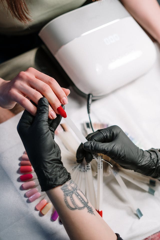
Knowing your season (and your specific red) is useful for three main reasons: Biological Alignment, Efficiency, and Intentionality.
1. Biological Alignment (The “Glow” Effect)
Your skin reacts to the colors placed near it.
- The Wrong Red: If a Light Summer wears a Dark Autumn Rust, the heavy yellow-brown tones can cast a shadow on the face, making the skin appear sallow, tired, or “muddy.” The color “arrives” before the person does.
- The Right Red: When that same person wears a Watermelon Red, the blue-pink base reflects the natural cool tones in their skin. This minimizes redness, brightens the whites of the eyes, and creates a “lit-from-within” glow.
2. Efficiency: The “Capsule” Logic
In the context of Conscious Curation, knowing your season eliminates the “guilt of the unused.”
- Predictable Results: You stop buying “pretty” colors that look great in the bottle but “off” on your hands.
- Automatic Coordination: Every color in a specific season’s palette is mathematically designed to coordinate with the others. If you know you are a True Autumn, your Brick Red nails will automatically match your olive coat, your cream sweater, and your gold jewelry without you having to think about it.
Why the “Red” is the ultimate test
Red is a unique color because it exists in every single season, but its temperature and weight shift drastically.
- Warm seasons see red as a version of Orange/Yellow.
- Cool seasons see red as a version of Blue/Pink.
By identifying your perfect red, you solve the hardest puzzle in your wardrobe. Once you find the red that makes your skin look vibrant, you have effectively cracked the code for your entire color palette.
Without further ado, lets look at the 12 seasons, one by one.
Light Spring
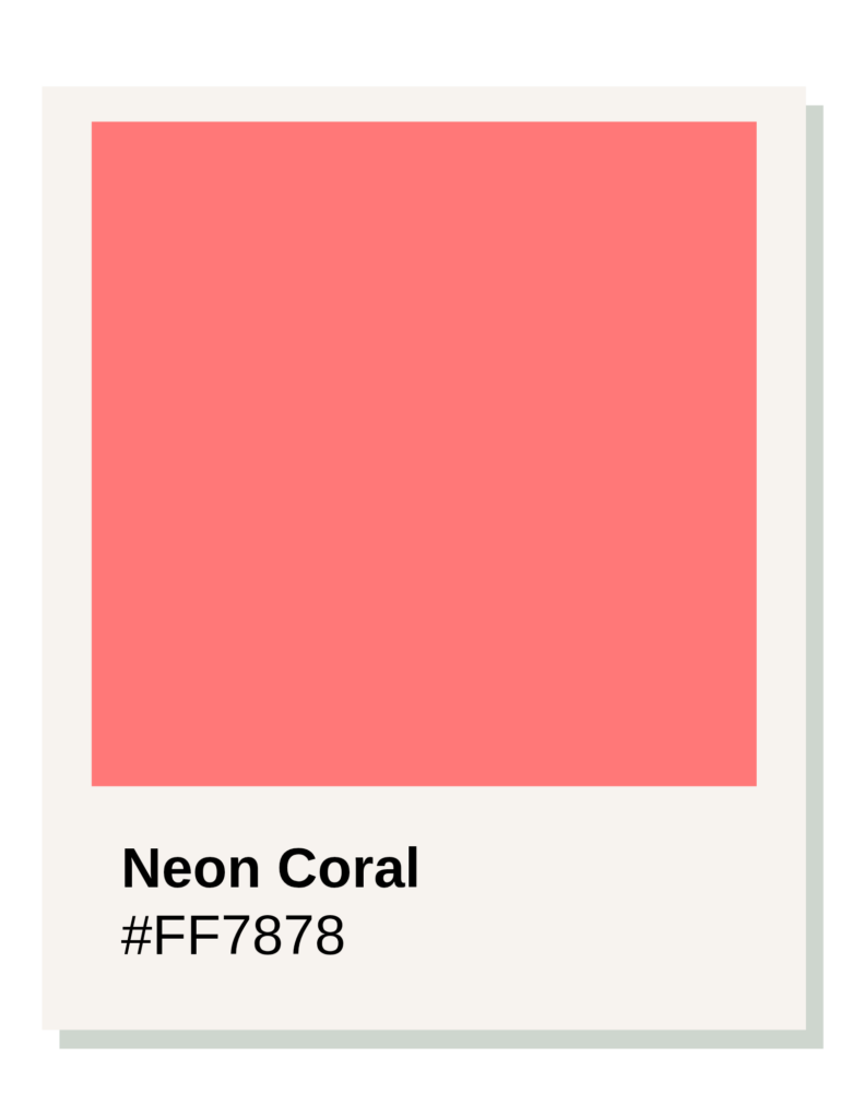
Shade: Coral Red, Hex Code: #FF6D6D
The #FF6D6D Coral Red is considered the “ideal” red for a Light Spring because it balances the three primary pillars of that season’s palette: Warmth, Lightness, and Clarity.
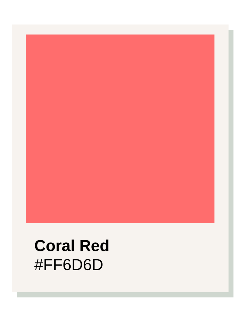
Here is the technical breakdown of why this specific shade works:
1. High Light Value
Light Spring is defined by its delicacy. A traditional, heavy red (like a deep Burgundy) has a low value (darkness) that would visually “weigh down” someone with this coloring, making them look tired or washed out. #FF6D6D has a high light value, meaning it contains enough white to keep the color “airy” and harmonious with fair, low-contrast features.
2. Warm Undertones
Light Spring sits between True Spring and Light Summer. While it shares “Lightness” with Summer, its primary temperature is warm.
- A “cool” red would have blue undertones, turning it into a berry or fuchsia.
- Coral Red has a yellow/orange base. This mimics the golden undertones in a Light Spring’s skin, creating a “glow” effect rather than looking like a separate stripe of color on the hand.
3. Moderate Brightness (Chroma)
Spring seasons require clarity; their colors shouldn’t look “muddy” or “dusty.” This hex code is clear and saturated enough to match the natural “sparkle” of a Spring, but because it is lightened, it doesn’t become the aggressive, neon red that might be found in a Bright Spring palette.
OPI Colors For Light Spring
Shrimp Cocktail
A textbook Light Spring match. An airy, illuminated coral-red that keeps a perfect level of transparency and warmth without looking heavy.
Always Within Peach
A soft, creamy light pastel peach that holds an ideal mathematical balance of golden warmth and high reflection value.
Data Peach
A luminous, light pearlescent peach that perfectly highlights the soft, delicate contrast boundaries of this clear palette.
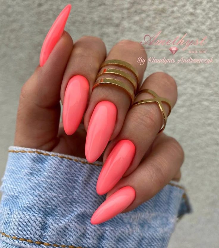
Neon Coral Nails for Light Spring
Comparison: Why not a “True Red”?
| Feature | True Red (#FF0000) | Coral Red (#FF6D6D) |
| Intensity | Overwhelming; “wears the person.” | Harmonious; complements the person. |
| Temperature | Neutral/Cold. | Warm/Peach-leaning. |
| Visual Weight | Heavy and Bold. | Soft and Bright. |
Application for Nails
In a nail polish context, this color often appears as a creamy bright coral. It reads as “red” to the observer, but it won’t clash with gold jewelry or the peach/apricot tones often found in a Light Spring wardrobe.
True Spring
Shade: Poppy Red, Hex Code: #E2362F
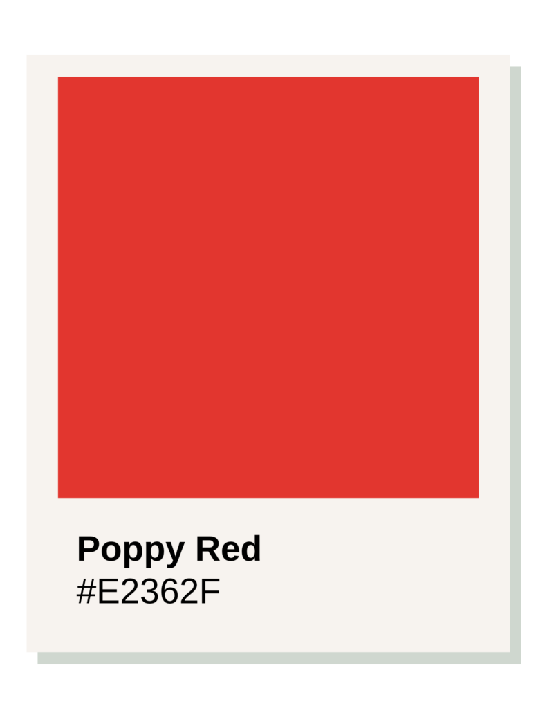
While Light Spring (the neighboring sub-season) needs colors that are “watered down” with white, True Spring requires colors that are “full strength.”
OPI Colors For True Spring
Aloha from OPI
A textbook True Spring red-orange creme. With an 87% purity score, it delivers a clear, vivid tropical punch with absolutely zero autumn mud.
I Eat Mainely Lobster
A classic orange-leaning coral. It features an integrated golden-pearl shimmer that beautifully reflects light to match warm golden skin tones.
Drop It Like It’s Hawt
A striking, fiery tomato-poppy red. Saturated and intensely warm, it provides a perfect classic red look while remaining clear and luminous.
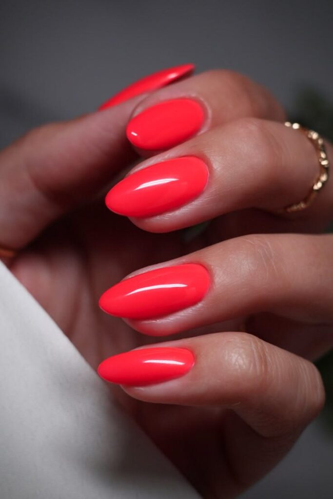
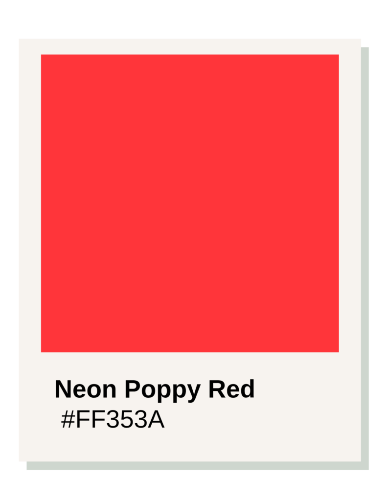
Neon Poppy Red
1. Pure Warmth (No Blue Undertones)
True Spring is the warmest of the three Spring sub-seasons. A “True Red” in the traditional sense often has a hidden blue base to make it look crisp. On a True Spring, that blue base will look slightly “off” or “cold” against the skin. Poppy Red has a strong yellow/orange base. It’s essentially the reddest an orange can get before it stops being orange, which perfectly complements the golden or peachy undertones of this season.
2. High Chroma (Vibrancy)
True Springs have a natural “glow” or “sparkle” to their features. They can handle—and actually need—high-saturation colors to look their best.
- #E2362F is a high-chroma color.
- If you put a muted or “soft” red next to a True Spring, they can look a bit dull.
- Poppy Red has the “energy” required to match their natural clarity without being as aggressive or “acidic” as the colors in the Bright Spring palette.
3. Medium Value
Unlike Light Spring, which needs colors to be quite pale, True Spring looks best in colors that have a “medium” weight. Poppy Red isn’t dark or “blackened” like an Autumn red, but it isn’t “pastel” like a Light Spring red. It has a solid, punchy presence that anchors a look.
The Visual Impact
When a True Spring wears Poppy Red, the color doesn’t look like a “statement” or a “costume”—it simply looks like an extension of their natural vitality.
How it compares to other Spring Reds:
- vs. Light Spring (#FF6D6D): Poppy Red is darker and much more saturated. It’s a “bold” red rather than a “sweet” red.
- vs. Bright Spring (#F62D44): Poppy Red is warmer. Bright Spring reds start to lean slightly more neutral or even a “warm-cool” hybrid because of the Winter influence, whereas Poppy Red stays strictly in the sun-drenched, warm category.
Style Application
In nail polish, this is that classic “Fire Engine” red that looks incredibly cheerful. It pairs perfectly with gold hardware and warm-toned accessories.
Bright Spring
Shade: Geranium Red, Hex Code: #F62D44
he #F62D44 Geranium Red is the “power red” for Bright Spring because this sub-season is defined by extreme clarity and a unique position between Spring and Winter.
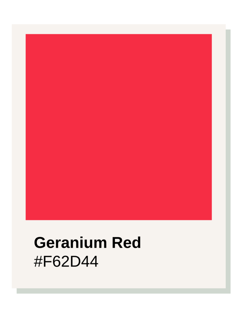
While True Spring is purely warm, Bright Spring can handle (and requires) a touch of neutral-cool sharpness to match their high-contrast features.
OPI Colors For Bright Spring
Cajun Shrimp
The ultimate Bright Spring grail. A blindingly clear, electric coral-red that hits maximum saturation to match this season’s high contrast.
We Seafood and Eat It
A vibrant, high-chroma watermelon crimson. It features a punchy, hot-pink-leaning red profile that demands Bright Spring clarity.
Live.Love.Carnaval
A fiery, high-intensity tropical poppy red. It provides maximum saturation without losing its clear, warm spring undertone.
Watermelon Red
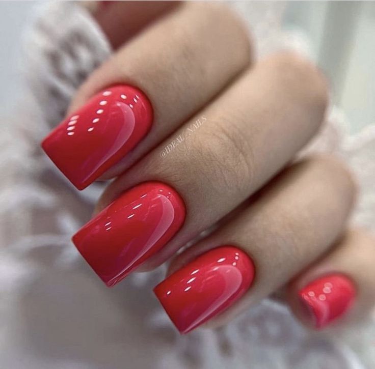
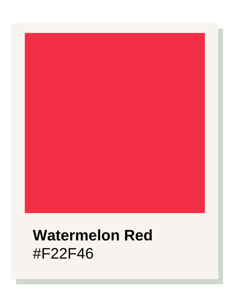
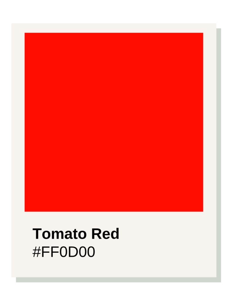
Tomato Red
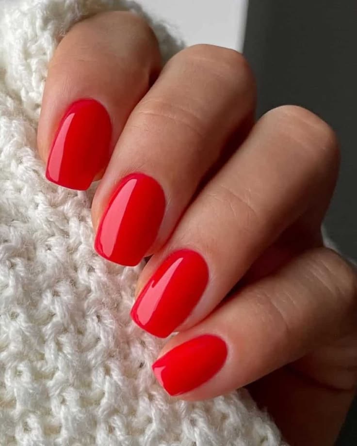
1. High Saturation (The “Winter” Influence)
Bright Spring is the “brightest” of all 12 seasons. It borrows its intensity from its neighbor, Winter. #F62D44 is a high-octane, saturated red. It doesn’t have the “milkiness” of Light Spring or the “earthiness” of Autumn. It is a vivid, pigment-heavy shade that stands up to the natural high contrast often found in a Bright Spring’s eyes and hair.
2. Neutral-Warm Balance
Unlike Poppy Red (True Spring), which is very yellow-based, Geranium Red is more neutral.
- It sits right on the edge of the warm/cool divide.
- It has enough warmth to satisfy the Spring requirement, but it’s “chilled” compared to a classic orange-red. This slight shift toward neutral allows it to look incredibly crisp rather than “heavy.”
3. Visual “Pop” (Chroma)
In color analysis, “Chroma” refers to how close a color is to being a pure neon or primary pigment. Bright Springs look washed out in muted colors, but they “sing” in high-chroma shades. Geranium is almost electric; it has a luminous quality that mimics the “glow” of Bright Spring skin.
Nail Polish Application
On the nails, Geranium Red often looks like a “Strawberry Red.” It’s a red that feels like it has a tiny drop of hot pink hidden inside it.
Why it Works for Bright Spring
Because this season is about “Conscious Curation” and high visual impact, a Geranium Red serves as a perfect intentional accessory. It’s a red that demands to be noticed but doesn’t feel “heavy” or “old-fashioned.” It’s modern, clean, and vibrant.
Light Summer
Shade: Watermelon Pink-Red, Hex Code: #E64E68
The #E64E68 Watermelon shade is the “red” of choice for a Light Summer because it mirrors the three defining traits of this season: Coolness, Lightness, and Softness.
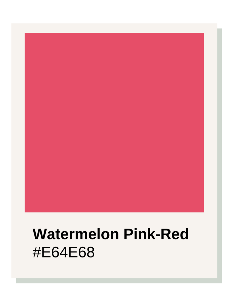
Light Summer sits between True Summer and Light Spring. It is a “Summer” first, meaning it needs cool tones, but it borrows “Lightness” from its Spring neighbor. This creates a unique requirement for a red that isn’t heavy or aggressive.
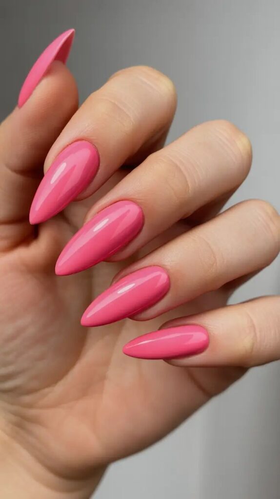
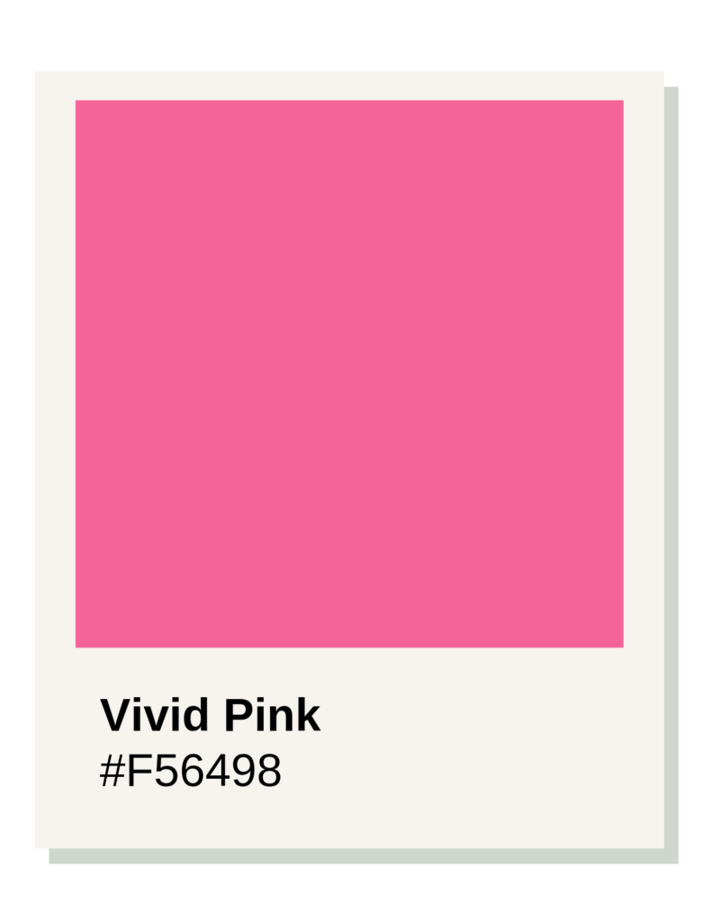
Vivid Pink
Featured in this image is a vivid pink nail, with the colour featured below.
Magenta Pink
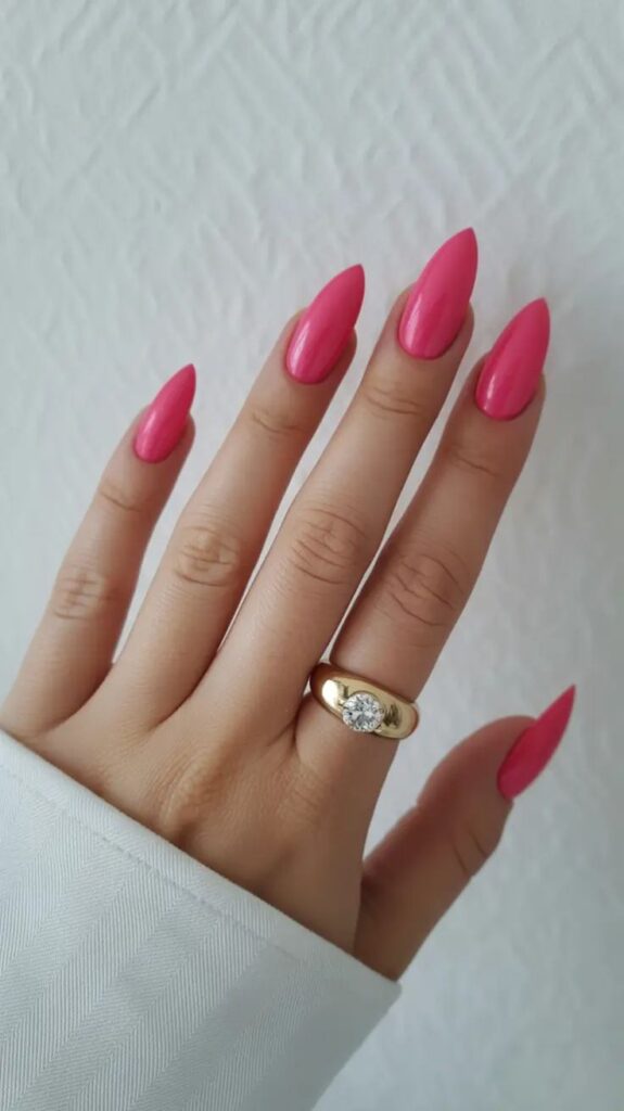
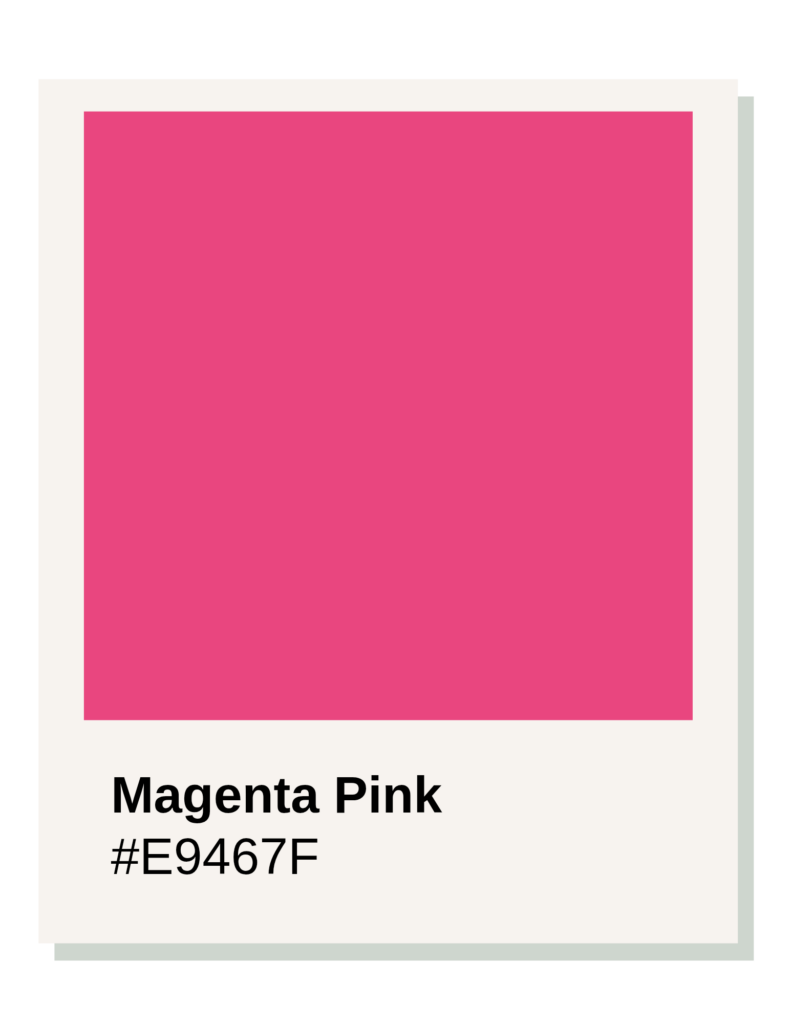
1. Cool Undertones (The Blue Influence)
While a Spring red leans toward orange, a Light Summer red leans toward Pink. #E64E68 has a blue/pink base rather than a yellow one. This ensures the color harmonizes with the cool, delicate undertones of the skin. On a Light Summer, a warm orange-red can make the skin look slightly yellowed or tired; this Watermelon shade makes the skin look clear and fresh.
2. High Light Value (The “Airy” Quality)
Light Summer is the lightest of all the cool seasons. A traditional deep red (like a Ruby) has a “heavy” visual weight that can overwhelm a Light Summer’s delicate features. Watermelon is a “diluted” red. It contains enough white/pink to keep the value high, ensuring the nails don’t look like “dark holes” against the hand, but rather a seamless pop of color.
3. Medium-Low Chroma (Softness)
True Winter needs “electric” colors, but Summer seasons are characterized by a slight “wash” or softness.
- #E64E68 is vibrant enough to be fun, but it isn’t “neon.”
- It has a slightly “watercolor” feel.
- It provides enough contrast to be visible without the jarring “shock” of a Bright Winter crimson.
Comparison: Light Summer vs. Light Spring
| Feature | Light Spring Red (#FF6D6D) | Light Summer Red (#E64E68) |
| Undertone | Warm (Peachy/Coral). | Cool (Pinky/Berry). |
| Association | Tropical Fruit / Sunset. | Fresh Berries / Watermelon. |
| Visual Temperature | Sunny. | Chilled. |
Why it works for a Light Summer
From an intentional style perspective, this shade is highly versatile. Because it sits on the border of “Pink” and “Red,” it bridges the gap between a feminine, soft aesthetic and a bold, classic one. It feels curated rather than accidental—it provides a polished look that respects the natural low-contrast “ethereal” quality of the Light Summer palette.
True Summer
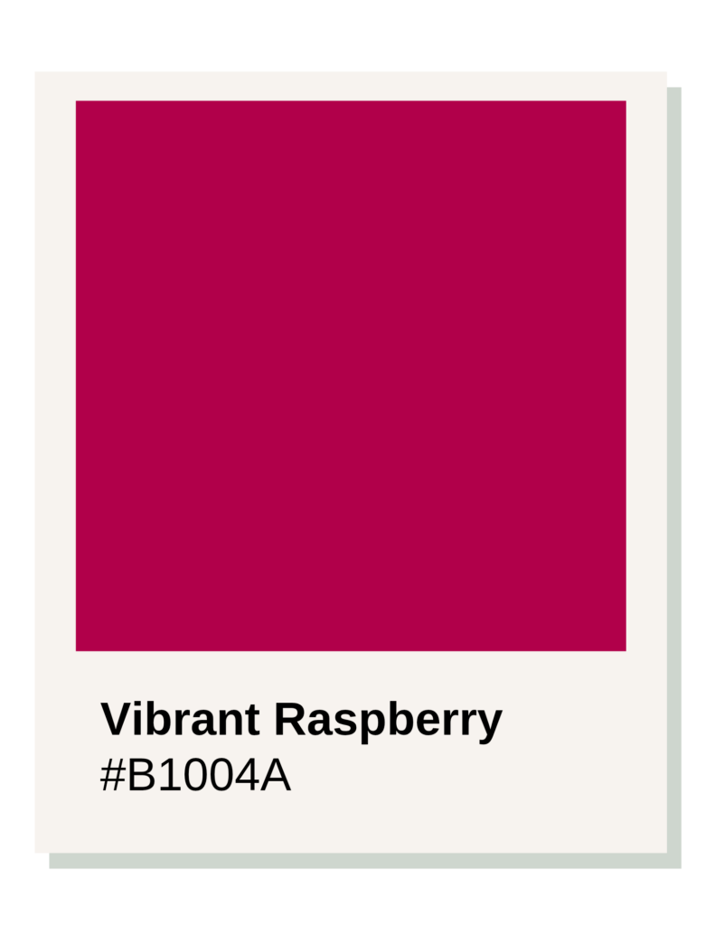
Shade: Raspberry Red, Hex Code: #C21E56
The #C21E56 Raspberry Red is the quintessential red for a True Summer because it perfectly captures the pure coolness and soft elegance of this season.
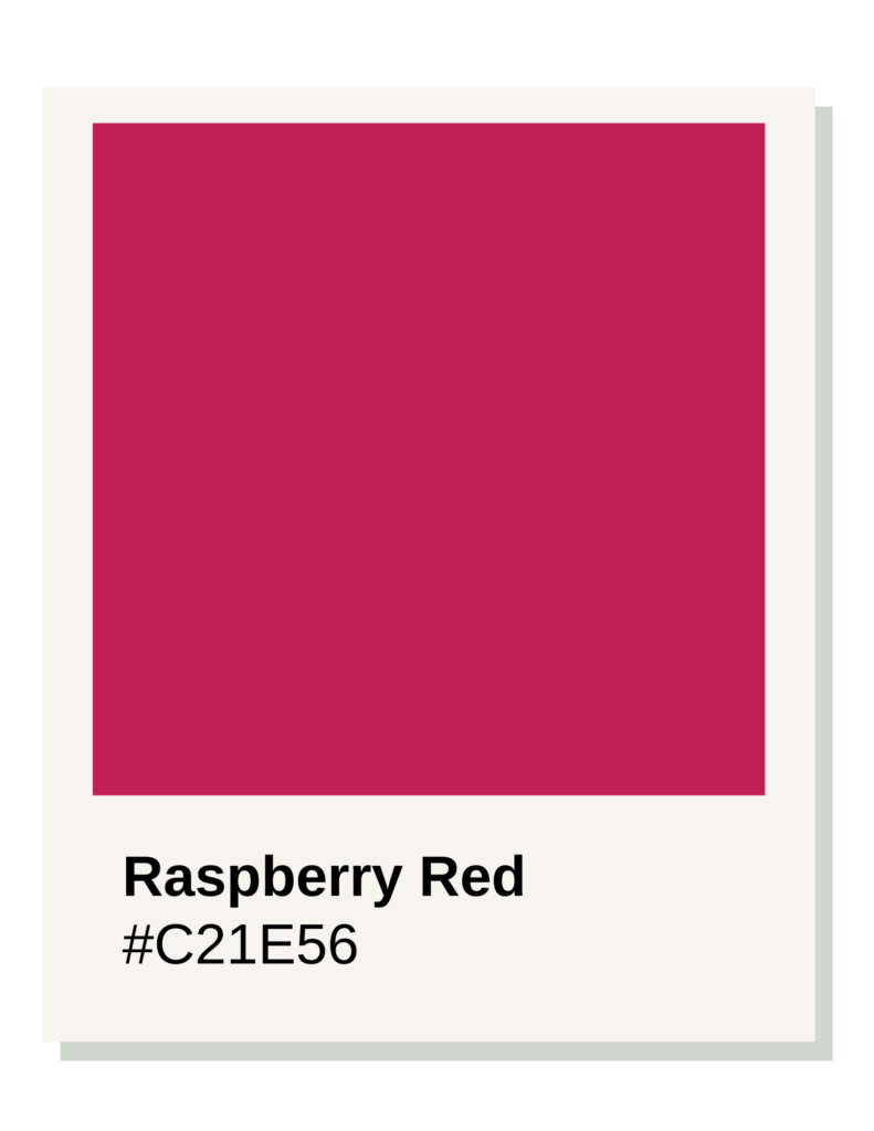
True Summer is the heart of the Summer family—it is entirely cool-toned, with no influence from the warm Spring or Autumn seasons. Therefore, its “red” isn’t a fire-engine red, but rather a deep, sophisticated berry.
Vibrant Raspberry
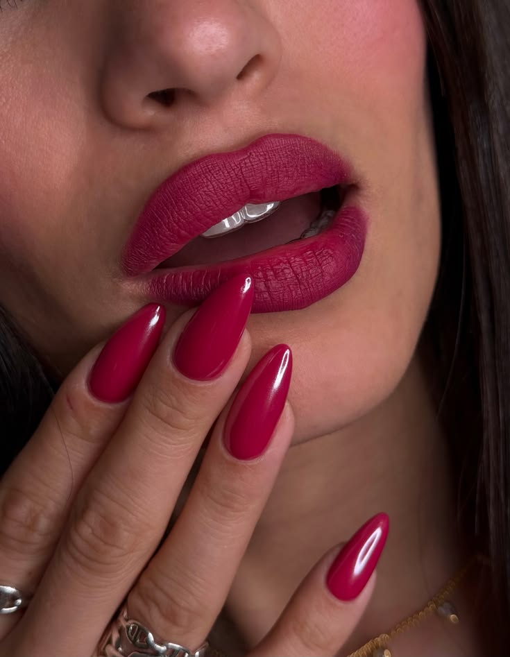
1. Pure Coolness (Blue-Based)
True Summer skin has a distinct blue or pink undertone. To harmonize with this, the red must also be blue-based. #C21E56 is essentially a red that has been infused with a significant amount of magenta/blue. This “chilled” quality ensures that the polish makes the skin look creamy and clear rather than sallow or “heated up,” which is what a warm red would do.
2. Muted Intensity (The “Soft” Filter)
Unlike the Winter seasons, which are “icy” and sharp, True Summer is “soft” and “smoky.”
- #C21E56 has a slightly desaturated quality.
- It doesn’t “shout” at the observer.
- While it is a medium-dark shade, it lacks the aggressive, neon-like clarity of a Bright Winter. This creates a refined, understated look that matches the gentle, low-to-medium contrast of a True Summer’s natural coloring.
3. Medium Value
True Summer sits in the middle of the value scale. It isn’t as “pastel” as Light Summer, but it isn’t as “blackened” as Dark Winter. Raspberry Red is a medium-depth shade. It provides enough contrast to look like a “classic red” manicure while remaining light enough to feel airy and effortless.
Comparison: True Summer vs. True Winter
| Feature | True Summer (#C21E56) | True Winter (#BE0027) |
| Chroma | Muted and “velvety.” | Clear and “icy.” |
| Base | Pink/Blue/Berry. | Pure Primary Red/Blue. |
| Feel | Understated and Natural. | Bold and High-Drama. |
The “Intentional” Factor
Raspberry Red is a highly functional choice. It acts as a “neutral” for the cool-toned wardrobe. It pairs seamlessly with navy, charcoal, and soft greys—the backbone of the True Summer palette. It feels like a choice made with intention, providing a pop of color that respects the natural softness of the wearer’s features rather than fighting against them.
On the nails, this shade often looks like a “cool cranberry.” It is professional, timeless, and perfectly balanced.
Soft Summer
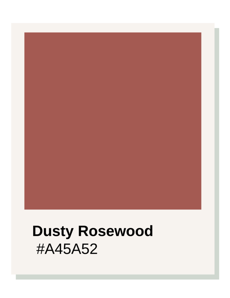
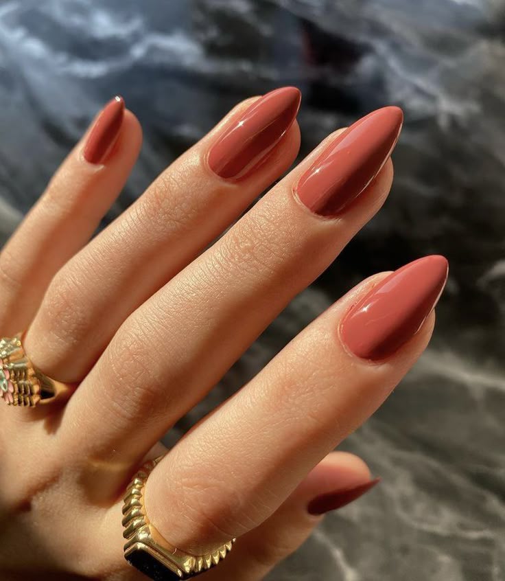
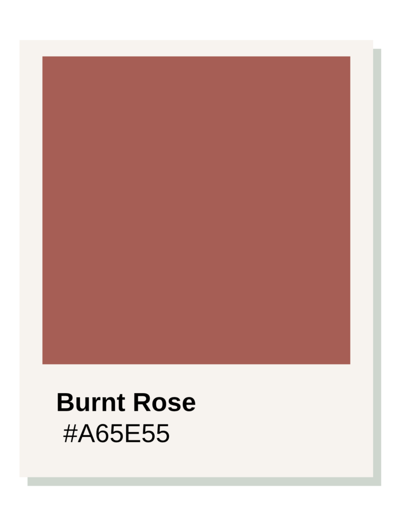
Shade: Dusty Rosewood, Hex Code: #A45A52
The #A45A52 Dusty Rosewood is the “best” red for a Soft Summer because this season is defined by Low Contrast and Mutedness.
Soft Summer is the most “greyed out” of all the cool seasons. It sits right on the border of Autumn, meaning it is cool-toned but has a “dusty” quality that makes traditional, bright reds look jarring or “separate” from the body.
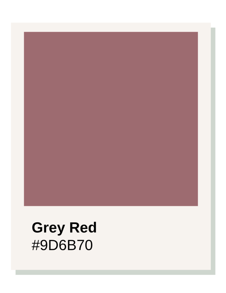
Grey Red
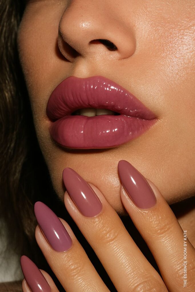
Burnt Rose
1. The “Grey” Influence (Low Chroma)
Soft Summer is characterized by softness. To match this, the colors must have a high percentage of grey in them. #A45A52 is essentially a red that has been “dialed down” with charcoal and mauve. On anyone else, this might look like a brownish-pink; on a Soft Summer, it harmonizes perfectly with the natural “smoky” quality of their skin, hair, and eyes, actually appearing as a sophisticated, muted red.
2. Temperature Neutrality
Because Soft Summer leans toward Autumn, it isn’t “icy” like a Winter. It is cool, but gently so.
- #A45A52 is a “tepid” red.
- It has enough blue to stay cool, but it isn’t a stark, piercing berry.
- This balance prevents the color from looking too “hot” (orange) or too “cold” (fuchsia), both of which would overwhelm the delicate balance of a Soft Summer.
3. Depth and Value
Soft Summers look best in “medium” tones—colors that aren’t too dark or too light. This Rosewood shade provides a “shadow” effect. It mimics the natural rose-red tones found in the lips and cheeks of a Soft Summer, creating a look that is intentional and “put together” without the harshness of a high-contrast manicure.
Comparison: Soft Summer vs. True Summer
| Feature | Soft Summer (#A45A52) | True Summer (#C21E56) |
| Primary Trait | Muted/Desaturated. | Cool/Berry. |
| Visual Texture | Velvet or Suede. | Satin or Silk. |
| Red “Style” | Earthy Rose. | Vivid Raspberry. |
The Curated Neutral
This shade is the ultimate “curated neutral.” It’s a red that doesn’t scream for attention but instead complements a wardrobe of sage greens, soft navys, and “greige” tones. It represents a conscious choice to prioritize harmony over a “shock” of color.
In nail polish terms, this is often found in “Antique Rose” or “Mauve-Red” collections. It looks incredibly expensive and polished precisely because it doesn’t fight against your natural coloring.
Soft Autumn
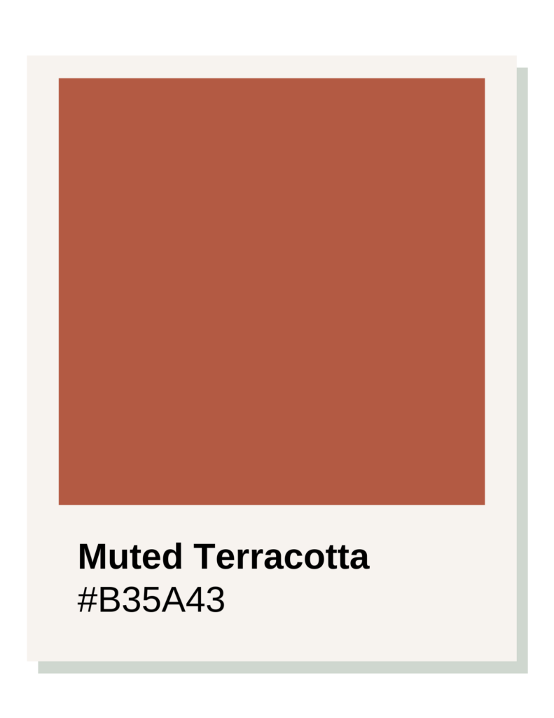
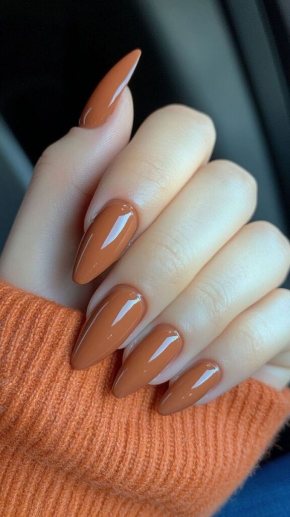
Shade: Muted Terracotta, Hex Code: #B35A43
The #B35A43 Muted Terracotta is the ideal “red” for a Soft Autumn because this season is defined by Mutedness and Gentle Warmth.
Soft Autumn sits on the border of Summer, meaning it is the least “fiery” of the Autumn sub-seasons. To work with this coloring, a red must be desaturated with brown and grey, resulting in a shade that mimics natural, sun-baked earth.
Grey Orange
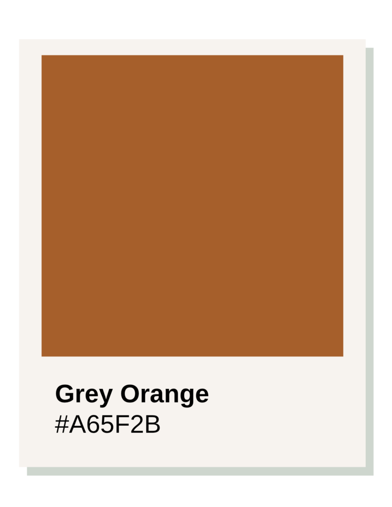
1. Low Chroma (The “Dusty” Quality)
Soft Autumn features are delicate and blended. A primary, vibrant red would create a “floating nails” effect where the color arrives in the room before the person does. #B35A43 has a significant amount of grey and brown mixed into the red base. This desaturation allows the color to “sink in” and harmonize with the skin rather than sitting harshly on top of it.
2. Gentle Warmth
While a True Autumn needs rich, golden heat, a Soft Autumn needs “tepid” warmth.
- #B35A43 is a toasted, brownish-red.
- It lacks the “hot” orange intensity of a Spring red.
- It avoids the “cool” pink tones of a Summer red.This specific balance reflects the “mousy” gold or soft honey undertones typically found in Soft Autumn skin and hair.
3. Organic Depth
Soft Autumns excel in “medium” values. This terracotta isn’t a deep, blackened chocolate, nor is it a pale peach. It has an organic, “clay-like” depth that provides a sophisticated pop of color while remaining grounded. It reads as a “natural red”—the kind of color you might see in a canyon or on a dried autumn leaf.
Comparison: Soft Autumn vs. Soft Summer
| Feature | Soft Autumn (#B35A43) | Soft Summer (#A45A52) |
| Undertone | Warm (Yellow/Brown base). | Cool (Blue/Grey base). |
| Natural Echo | Clay, Sandstone, Dried Spices. | Rosewood, Antique Mauve, Slate. |
| Visual Weight | Earthy and Toasted. | Smoky and Velvet. |
The Bridge Between a Neutral and a Statement Color
This shade is incredibly functional. It acts as a bridge between a neutral and a statement color. Because Soft Autumns often build wardrobes around olive greens, creams, and oatmeals, a Terracotta nail provides an intentional, warm accent that feels cohesive rather than disruptive.
In the world of nail polish, this is your “Spice,” “Canyon,” or “Sienna” red. It looks effortless, expensive, and deeply connected to a natural, intentional lifestyle.
True Autumn
Shade: Spiced Brick Red, Hex Code: #A62C21
The #A62C21 Spiced Brick Red is the definitive red for a True Autumn because it embodies depth, pure warmth, and rich saturation.
True Autumn is the “warmest” of the Autumn family. Unlike Soft Autumn, which is muted and greyed-out, True Autumn needs colors that feel “thick” and “heavy”—like the colors of a forest at the peak of October.
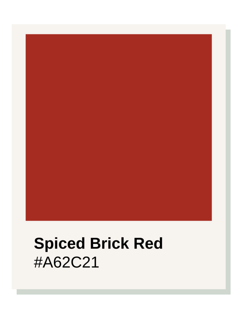
1. High Yellow/Orange Base (Pure Warmth)
True Autumn sits far away from the cool Winter and Summer influences. A “True Red” (neutral) or a “Blue Red” (cool) will often look stark or even slightly purple against True Autumn skin, which has strong golden or bronze undertones. #A62C21 is a red infused with burnt orange and golden-brown. It creates a “glow” on the hands, making the skin look healthy and vibrant.
2. Rich “Spiced” Intensity (Chroma)
While not “neon” like a Spring, True Autumn colors are rich and pigmented.
- #A62C21 isn’t “dusty” or “smoky” like the Soft seasons.
- It has a solid, opaque presence.
- The “Spiced” quality comes from the balance of red and brown, providing a look that is bold but grounded in nature.
3. Medium-Dark Value
True Autumn features usually have a medium level of contrast. A very light red would look “thin” or “weak,” while a black-burgundy might feel too heavy and “goth.” Brick Red sits perfectly in the middle-dark range. It has enough “weight” to look expensive and polished without being overwhelming.
Comparison: True Autumn vs. True Spring
| Feature | True Spring (#E2362F) | True Autumn (#A62C21) |
| Undertone | Clear Golden / Sunny. | Burned Golden / Earthy. |
| Base | Yellow (Poppy/Fire). | Brown (Brick/Spice). |
| Visual Vibe | Playful and Bright. | Sophisticated and Substantial. |
The Foundational Color
Brick Red is a foundational color. It isn’t a “trend” red; it is a “legacy” red. It pairs perfectly with the True Autumn wardrobe of forest greens, deep teals, and mustard yellows. It feels intentional—like a choice made to honor the natural, rhythmic cycles of the seasons.
On the nails, this color looks like a classic Burnt Sienna. It is warm, inviting, and looks exceptionally high-end when paired with gold or bronze jewelry.
Dark Autumn
Shade: Rust Red, Hex Code: #862617
The #862617 Rust Red is the “power red” for a Dark Autumn because this sub-season is defined by Depth and Warmth, sitting right on the border of Winter.
While True Autumn is all about “spice,” Dark Autumn needs “shadow.” This season requires colors that are heavily blackened while maintaining a core of golden heat.
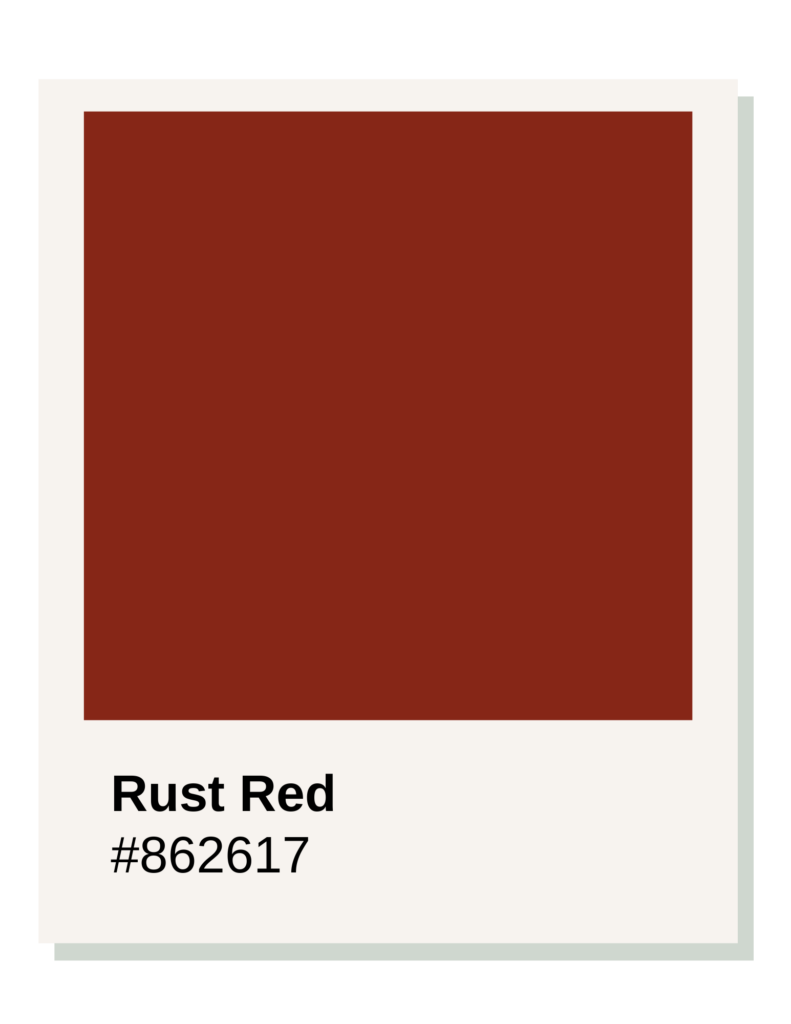
1. Low Value (The Power of Depth)
Dark Autumn is the darkest of the warm seasons. To harmonize with the high-contrast, deep features of this palette, a red must have a low “value” (meaning it is dark). #862617 is a heavily blackened red. A bright, light red would look “cheap” or “plastic” against Dark Autumn skin; this deep Rust looks expensive, grounding, and sophisticated.
2. The “Smoldering” Warmth
Because Dark Autumn sits next to Winter, it borrows some of Winter’s intensity but keeps its Autumn warmth.
- #862617 is not a cool burgundy or a purple-toned wine.
- It is a “burned” red, containing a deep base of chocolate and copper.
- This creates a “smoldering” effect that complements the bronze or deep olive undertones often found in Dark Autumn skin.
3. High Saturation in a Dark Base
Unlike Soft Autumn, which is “dusty,” Dark Autumn is “velvety.” The color is concentrated and rich. #862617 has a high pigment density. It provides a solid, opaque look on the nails that matches the “Mountain” style root—strong, professional, and authoritative.
Comparison: Dark Autumn vs. Dark Winter
| Feature | Dark Autumn (#862617) | Dark Winter (#73001C) |
| Undertone | Warm (Yellow/Orange base). | Cool (Blue/Purple base). |
| Visual Texture | Burned Wood / Copper. | Black Cherry / Velvet. |
| Metal Pairing | Antique Gold / Bronze. | Dark Silver / Gunmetal. |
The “Chameleon” Shade
Rust Red is a “chameleon” shade. It is dark enough to act as a neutral (pairing with blacks, deep greens, and creams) but rich enough to be a statement. It reflects a “Mountain” and “Earth” style root perfectly—it feels natural and grounded, yet commandingly polished.
On the nails, this often appears as a Deep Mahogany or Oxblood with a warm tilt. It is the ultimate “boss” red for someone with deep, warm coloring.
Bright Winter
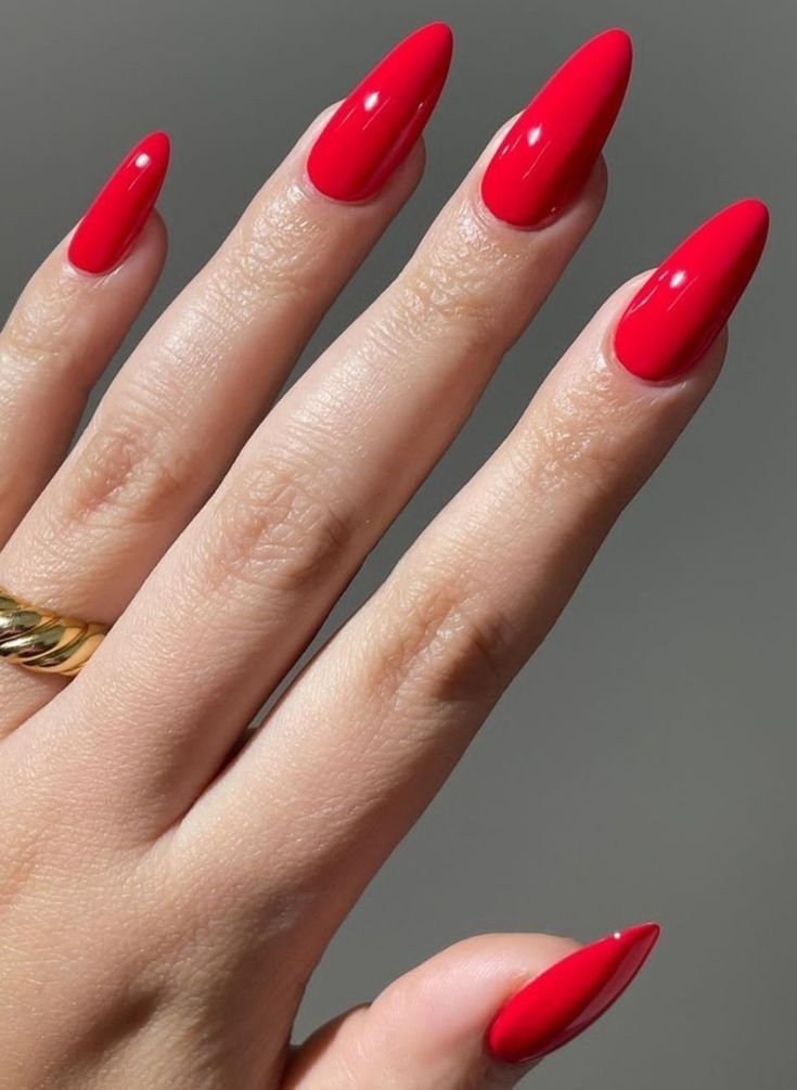
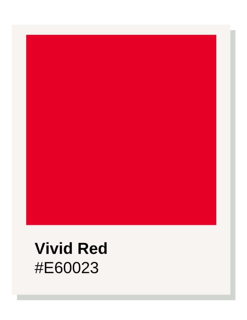
Shade: Crimson, Hex Code: #D60036
The #D60036 Crimson is the ultimate red for a Bright Winter because this season is defined by maximum contrast, icy coolness, and brilliance.
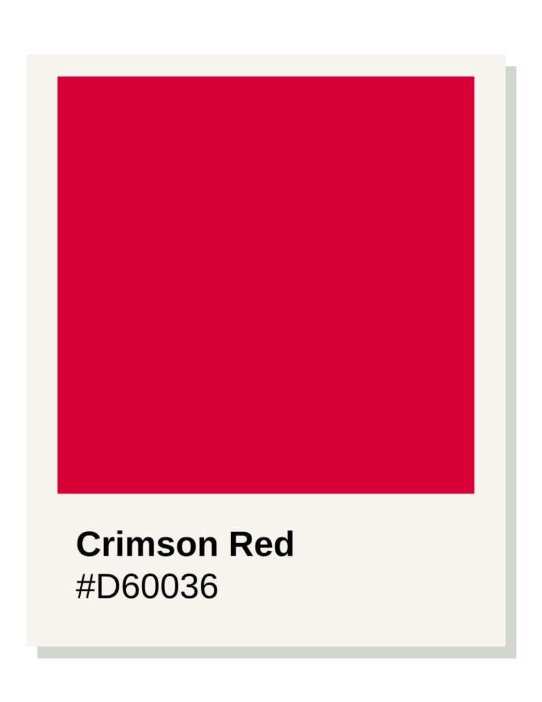
Bright Winter is the “Winter influenced by Spring.” It takes the deep, cool base of Winter and adds the high-energy “pop” of Spring. This creates a need for a red that is incredibly vivid and clear—almost like a neon jewel.
1. High Chroma (The “Electric” Factor)
Bright Winters “disappear” in muted or earthy colors. To match the natural clarity of their eyes and skin, they need high-chroma colors. #D60036 is a piercing, saturated red. It lacks any grey or brown “muddiness.” On the nails, it looks like a glowing ruby, providing the sharp “snap” of color that this season requires to look vibrant rather than overwhelmed.
2. Neutral-Cool Undertone
While True Winter is “pure ice,” Bright Winter sits on the border of Spring. This means its red can be a Neutral-Cool.
- It is definitely not “orange” (too warm).
- It is not quite “purple” (too cool/muted).
- It is a Magenta-leaning Red. This slight pinkish-cool base creates a “clean” look that makes the whites of the eyes look brighter and the skin look luminous.
3. Medium-Light Value (Visual Punch)
Unlike Dark Winter, which needs “blackened” reds, Bright Winter needs colors that stay “bright.” #D60036 has a medium value that feels “light-filled.” It is a high-visibility red that acts as a focal point, matching the high-contrast physical traits of the season.
Comparison: Bright Winter vs. Bright Spring
| Feature | Bright Winter (#D60036) | Bright Spring (#F62D44) |
| Undertone | Cool (Pink/Blue base). | Warm (Yellow/Orange base). |
| Vibe | Icy, Sharp, Jewel-like. | Sunny, Tropical, Electric. |
| Visual Weight | Striking and Crisp. | Playful and Radiant. |
The Nail Polish Power Move
In nail polish, this is your “Power Red” or “True Crimson.” It looks best in a high-gloss finish to emphasize the “Bright” aspect of the season.
True Winter
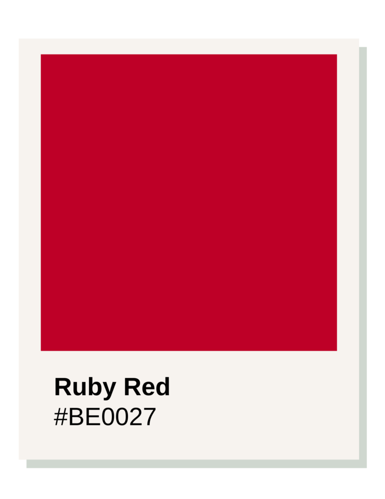
Shade: Ruby Red, Hex Code: #BE0027
The #BE0027 Ruby Red is the definitive red for a True Winter because it represents pure, icy coolness and high-contrast clarity.
True Winter is the “heart” of winter, untouched by the warmth of Spring or the earthiness of Autumn. Consequently, its ideal red is a primary color that has been “chilled” to the bone with blue undertones.
1. Absolute Coolness (Blue-Based)
True Winter skin possesses distinct cool undertones (often appearing pink, olive-cool, or blue-tinged). #BE0027 is a “blue-red.” It contains zero yellow or orange. When a True Winter wears a warm red, their skin can look sallow or tired; when they wear Ruby Red, the blue base in the polish reflects the blue in their skin, making the hands look bright, clear, and “expensive.”
2. High Clarity (Clear Chroma)
True Winters are characterized by “sharpness.” Their eyes and hair often stand out in high contrast against their skin.
- #BE0027 is a “clear” color—it has no grey (which would make it a Summer shade) and no brown (which would make it an Autumn shade).
- This clarity mimics the visual “snap” of a True Winter’s features. It is a bold, “saturated” red that doesn’t look like it’s fading into the background.
3. Balanced Value
While Dark Winter needs blackened reds and Bright Winter needs “glowing” reds, True Winter needs a Primary Red. Ruby Red is the middle-ground of the Winter value scale. It is deep enough to look “royal” and authoritative, but bright enough to remain striking. It is the “True Red” that most people imagine when they think of classic Hollywood glamour.
Comparison: True Winter vs. True Summer
| Feature | True Winter (#BE0027) | True Summer (#C21E56) |
| Clarity | Clear, sharp, and “icy.” | Muted, soft, and “velvety.” |
| Saturation | High (Primary Red). | Medium (Berry/Raspberry). |
| Visual Weight | Bold and Substantial. | Delicate and Hazy. |
The Ruby Red Uniform
Ruby Red is the ultimate “uniform” color. It is:
- Commanding: It project’s professional authority.
- Timeless: It bypasses trends, fitting into a “conscious curation” philosophy where you buy once and buy well.
- Structured: It provides a clean, sharp edge to a look that complements tailored clothing and high-contrast accessories.
In nail polish terms, this is your “Classic Blue-Red” or “Royal Ruby.” It looks most intentional when worn in a flawless, high-shine finish.
Shade: Poppy Red, Hex Code: #E2362F
Dark Winter
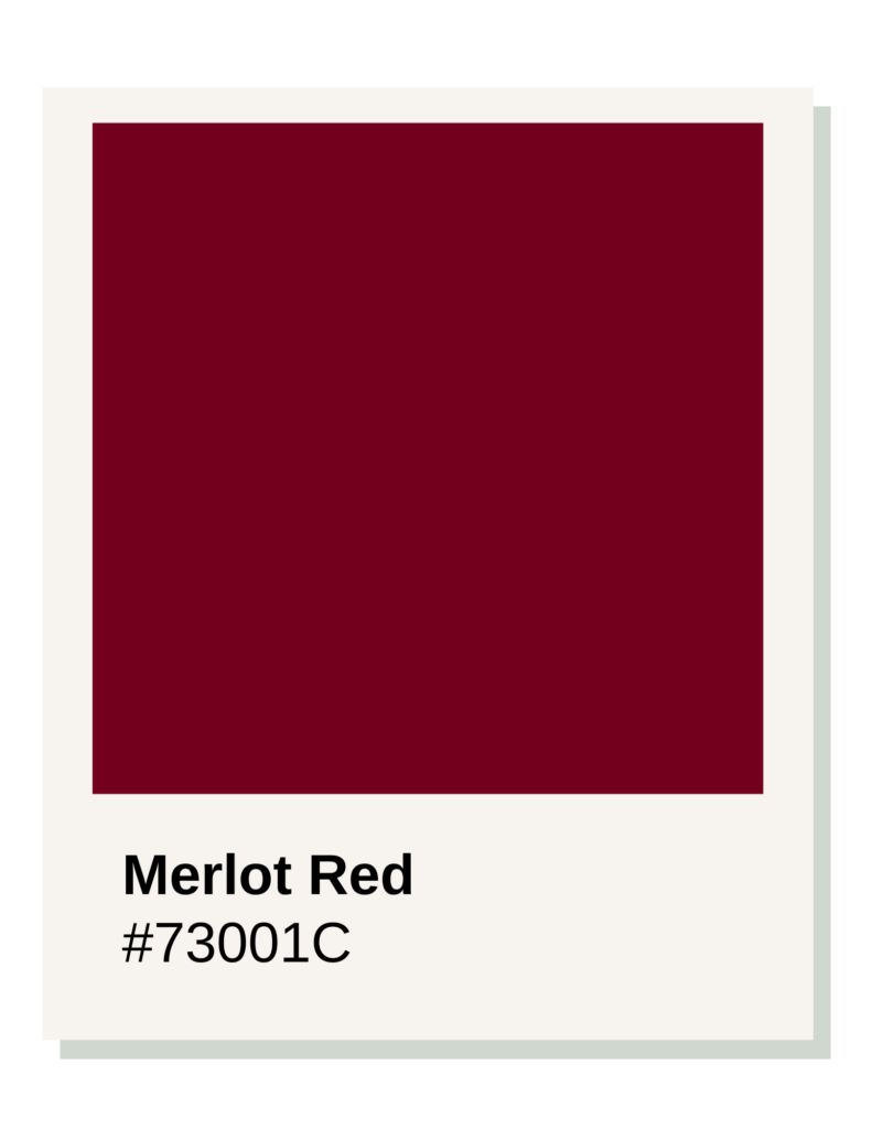
Shade: Merlot, Hex Code: #73001C
The #73001C Merlot is the definitive red for a Dark Winter because this season is defined by Depth and Coolness, sitting right on the border of Autumn.
While True Winter is about “icy” clarity, Dark Winter is about “shadow.” This season requires colors that are heavily blackened while maintaining a core of cool, blue-based pigment.
1. Maximum Depth (Low Value)
Dark Winter is the deepest of the cool seasons. To harmonize with the high-contrast, “heavy” features of this palette—such as deep-set eyes or dark hair—a red must have a very low value. #73001C is a “blackened” red. A bright, poppy red would look “thin” or “distracting” against Dark Winter skin; this deep Merlot looks integrated, grounding, and authoritative.
2. Cool/Purple Undertones
Because Dark Winter sits next to Autumn, it borrows some of Autumn’s weight but keeps its Winter temperature.
- #73001C is not a “brick” or “rust” red (too warm).
- It is a “Black Cherry” red, containing a deep base of blue and violet.
- This creates a velvety, “dark-fruit” effect that complements the cool, often olive-toned or “stony” undertones found in Dark Winter skin.
3. Saturated but “Smoldering”
Unlike Summer seasons, which are “smoky” or “greyed out,” Dark Winter colors are rich and concentrated. #73001C has high pigment density. It provides a solid, opaque look on the nails that matches a sophisticated, high-end aesthetic. It is a “power” color that feels more mysterious and nocturnal than the “daytime” reds of the Spring or Summer seasons.
Comparison: Dark Winter vs. Dark Autumn
| Feature | Dark Winter (#73001C) | Dark Autumn (#862617) |
| Undertone | Cool (Blue/Purple base). | Warm (Yellow/Orange base). |
| Visual Texture | Velvet / Black Cherry. | Burned Wood / Rust. |
| Metal Pairing | Silver / Platinum. | Gold / Bronze. |
The Deep Red
In nail polish, this is your “Deep Burgundy,” “Bordeaux,” or “Oxblood.” It looks best in a high-gloss finish, which emphasizes its jewel-like depth and sophisticated edge.
Understanding the Palette Groups
- Warm Seasons (Spring/Autumn): These reds contain yellow or orange bases. They range from light peaches to deep, earthy browns.
- Cool Seasons (Summer/Winter): These reds contain blue or pink bases. They range from soft berry tones to deep, wine-colored berries.
- Muted vs. Bright: If a color looks “greyed out” or soft, it belongs to a Soft or Summer sub-season. If it looks “electric” or pure, it belongs to a Bright or Winter sub-season.