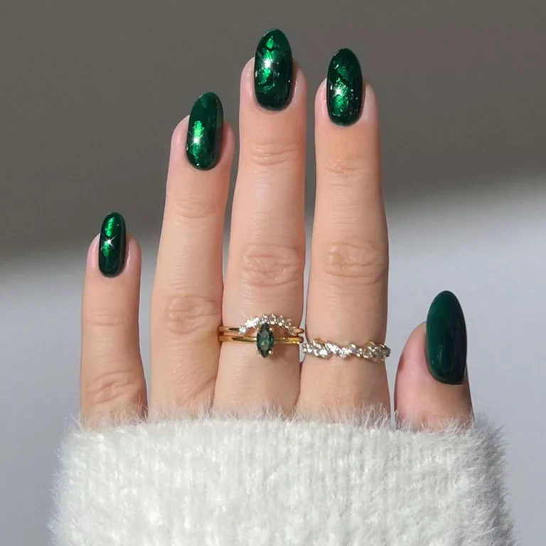
Autumnal Fingers: Nailing Cozy Fall Nail Trends
Autumn is the perfect time to shift your nail palette away from the bright, airy pastels of summer and embrace richer, more grounded tones. The best autumn nail colors mirror the changing natural landscape and the cozy, comforting textures of the season.
Here is a look at the top color families for autumn nails and why they work so beautifully:
1. Rich Earth Tones
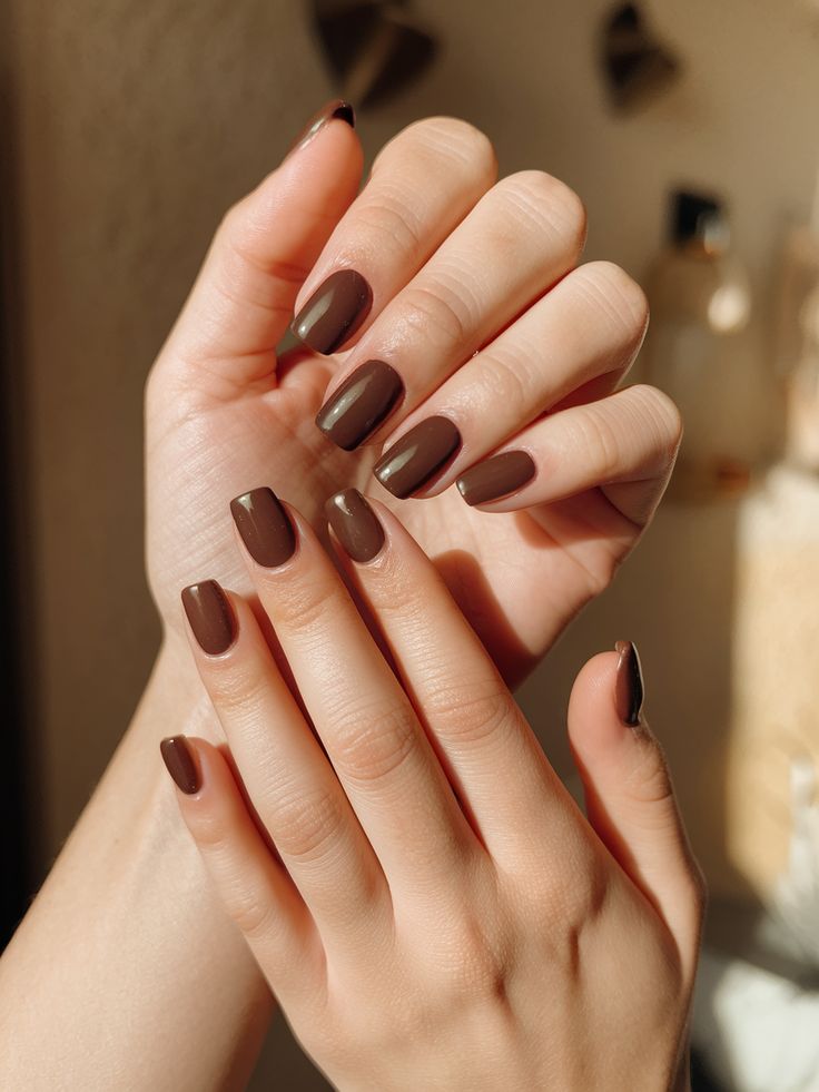
Chocolate Brown & Espresso: Deep browns have officially become the “new black” for autumn. They offer a luxurious, high-fashion minimalism that feels incredibly sophisticated and warm.
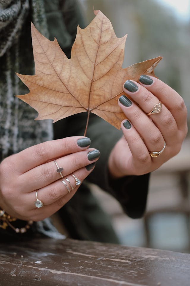
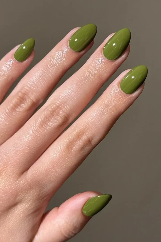
Olive & Forest Green: Green is a fantastic alternative neutral. Olive brings a slightly muted, earthy vibe, while deep forest green adds a touch of moody drama that pairs perfectly with cozy knitwear.
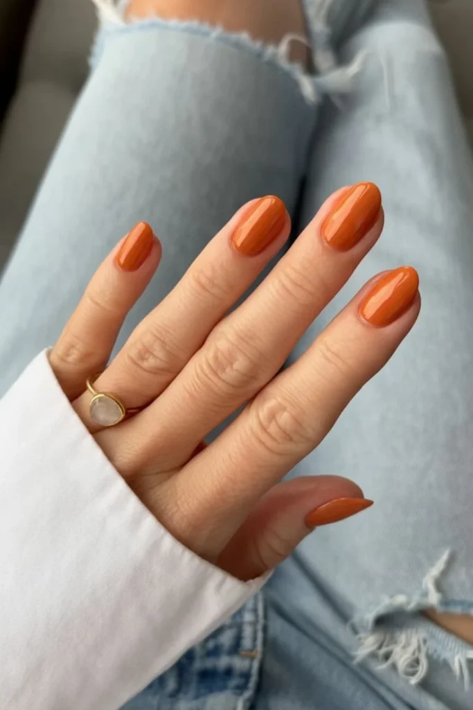
Terracotta & Burnt Orange: If you love warmth but want to avoid looking too bright, terracotta bridges the gap. It captures the essence of fallen leaves and adds an instant pop of cozy color.
Bitter Espresso Brown
This is an ultra-chic, high-gloss bitter espresso brown (modeled here alongside the Rhode Espresso lip tint). It is a very dark, near-black brown with subtle warm, mahogany undertones. Unlike a flat black, it retains a distinct warmth and richness when it catches the light, offering an incredibly sophisticated, “quiet luxury” alternative to typical vampy shades.
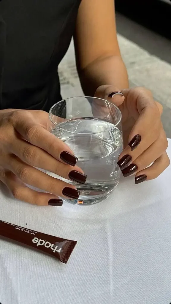
- Color Name: Espresso / Dark Chocolate / Bitter Mocha
- Hex Code: Approximately #281813 (an extremely deep, blackened brown)
- Pantone Match: PANTONE 19-0912 TCX (Chocolate Fondue) or PANTONE 19-1015 TCX (Fudge)
Closest OPI Nail Polish Matches
To get this exact deeply saturated, chocolate-espresso aesthetic, here are the top OPI contenders:
- OPI “Cliffside Karaoke” (Best Overall Match): A stunning, deep espresso brown cream from their recent palettes. It hits that exact bitter-chocolate tone perfectly without turning gray or looking like a flat black.
- OPI “That’s What I’m Talking About” (For a rich, dark mocha): A gorgeous, deep, dark brown cream that gives that ultra-glossy, high-fashion warmth.
- OPI “Shh… It’s Top Secret!” (For the ultimate near-black look): This is a deeply dark, rich espresso that looks almost black in low lighting but reveals its beautiful, warm brown undertones when exposed to direct sunlight.
- OPI “Over the Taupe” (For a lighter alternative): If you love the chocolate family but want a shade that reads distinctly as a medium-dark brown even in the shade, this classic cream is an excellent, slightly lighter option.
Which Color Season Are Bitter Espresso Brown Nails Best For?
Because this shade is deeply saturated, dark, and holds a rich, grounding warmth, it leans heavily into the deeper palettes:
The Absolute Best Match: Dark Autumn & Dark Winter: It is a phenomenal neutral for Dark Autumns, matching their natural richness and warmth perfectly. For Dark Winters, it serves as a stunning, high-contrast alternative to plain black, blending beautifully with their deep features.
The Surprising Crossover: True Autumn: Because it is distinctly a warm-toned, earth-derived shade, True Autumns can wear this as a brilliant, dramatic statement color for the colder months.
This color is the ultimate choice if you want a look that is modern, minimalist, and intensely polished!
2. Moody Berries & Deep Reds
Burgundy & Bordeaux: A timeless classic for a reason. As soon as the temperature drops, deep wine reds instantly elevate an outfit. They are bold, elegant, and universally flattering.
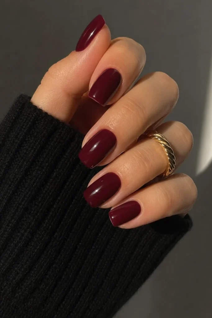
Plum & Blackberry: For those who love dark, vampy nails but want a hint of color, deep purples offer a mysterious, velvety depth that feels very intentional and polished.
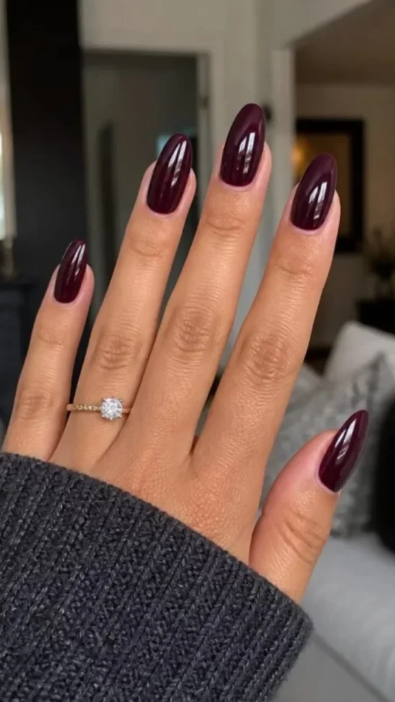
Deep Bordeaux
This is a stunning, sophisticated deep bordeaux or black cherry. It is a rich, high-gloss, vampy red with strong brown and black undertones. It strikes the perfect balance between an elegant wine and a moody, dark cherry, making it a definitive autumn classic.
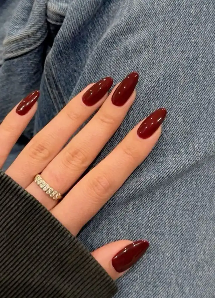
- Color Name: Bordeaux / Oxblood / Deep Black Cherry
- Hex Code: Approximately #4A0E0E (a deep, dark burgundy-red)
- Pantone Match: PANTONE 19-1524 TCX (Obsidian) / 19-1627 TCX (Ruby Wine)
Closest OPI Nail Polish Matches
To capture this deep, glossy, dramatic red finish, here are the absolute best OPI matches:
- OPI “Got the Blues for Red” (Best Overall Match): This is a beautiful, dark, creamy crimson that hits the exact level of depth shown in the photo. It’s slightly darker than a standard red but retains its rich, bloody-wine vibrancy.
- OPI “Malaga Wine” (The Classic Alternative): A rich, intoxicating wine-red cream. It has a slightly more purple-berry undertone than the photo but gives an almost identical, ultra-polished, sophisticated look.
- OPI “Lincoln Park After Dark” (For a darker, edgier vibe): If you want to push this look to its absolute darkest limit, this iconic shade looks nearly black in low light but flashes a rich, deep purple-red in the sun.
- OPI “Complimentary Wine” (Rich and deep): A gorgeous, modern deep velvet-burgundy that mimics that expensive-looking, moody autumn depth flawlessly.
Which Color Season Is Bordeaux Red Best For?
Because this shade is deep, intense, and slightly muted by its dark undertones, it plays beautifully across the deeper ends of the spectrum:
The Absolute Best Match: Dark Autumn & Dark Winter: This color thrives on contrast and depth. For Dark Autumns, the warm brown undertones ground the red perfectly. For Dark Winters, the sheer depth and richness match their natural high-contrast intensity beautifully. It also works as a gorgeous, dramatic statement shade for True/Deep Winters.
This is the ultimate confidence-boosting, power neutral for anyone who loves a bit of classic, vampy drama when the weather cools down!
3. Sophisticated Muted Neutrals
- Mushroom & Warm Taupe: If you prefer a clean, minimalist look, swap your stark summer whites for soft taupes, grays, and mushroom tones. These colors have a quiet luxury feel—they are understated, elegant, and go with absolutely everything.
- Creamy Chai & Toffee: Soft, warm nudes with a hint of caramel undertone feel incredibly comforting and clean without looking washed out.
Toffee Caramel
This shade is a rich, warm, and creamy toffee caramel. It is a gorgeous mid-tone nude with distinct golden, peachy-brown undertones that feel deeply comforting, creamy, and classic.
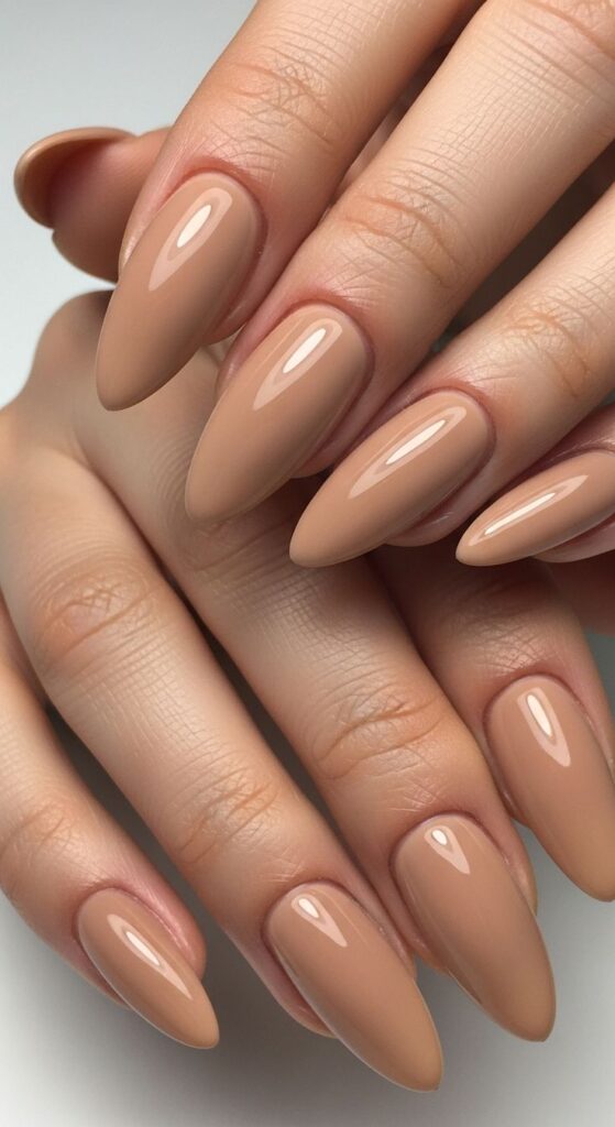
- Color Name: Warm Toffee / Soft Caramel / Creamy Camel Nude
- Hex Code: Approximately #C49E82 (a warm, medium-toned tan with subtle peach-gold undertones)
- Pantone Match: PANTONE 16-1334 TCX (Tan) or PANTONE 16-1422 TCX (Macaroni and Cheese)
Closest OPI Nail Polish Matches
To recreate this ultra-smooth, warm caramel aesthetic, here are the best OPI matches:
- OPI “San Tan-tonio” (Best Overall Match): This is a legendary OPI shade that perfectly captures this exact warm, creamy, wear-with-everything tan. It has that precise medium-depth camel tone without leaning orange.
- OPI “A-taupe the Space Needle” (For a slightly richer, deeper version): If you want just a hint more depth for autumn, this creamy, warm-toned tan-brown is an incredible match for that rich toffee vibe.
- OPI “Karanila” or “Coconuts Over OPI” (For a slightly lighter, subtler take): If you want this exact warm color family but a fraction lighter on the nails, “Coconuts Over OPI” is a beautiful, warm, creamy toasted-almond nude.
- OPI ” Samoan Sand” (For a sheerer look): If you prefer a more translucent, buildable finish rather than a solid cream opaque, layering this classic warm nude will give you a very similar chic, warm glow.
Coconuts Over OPI
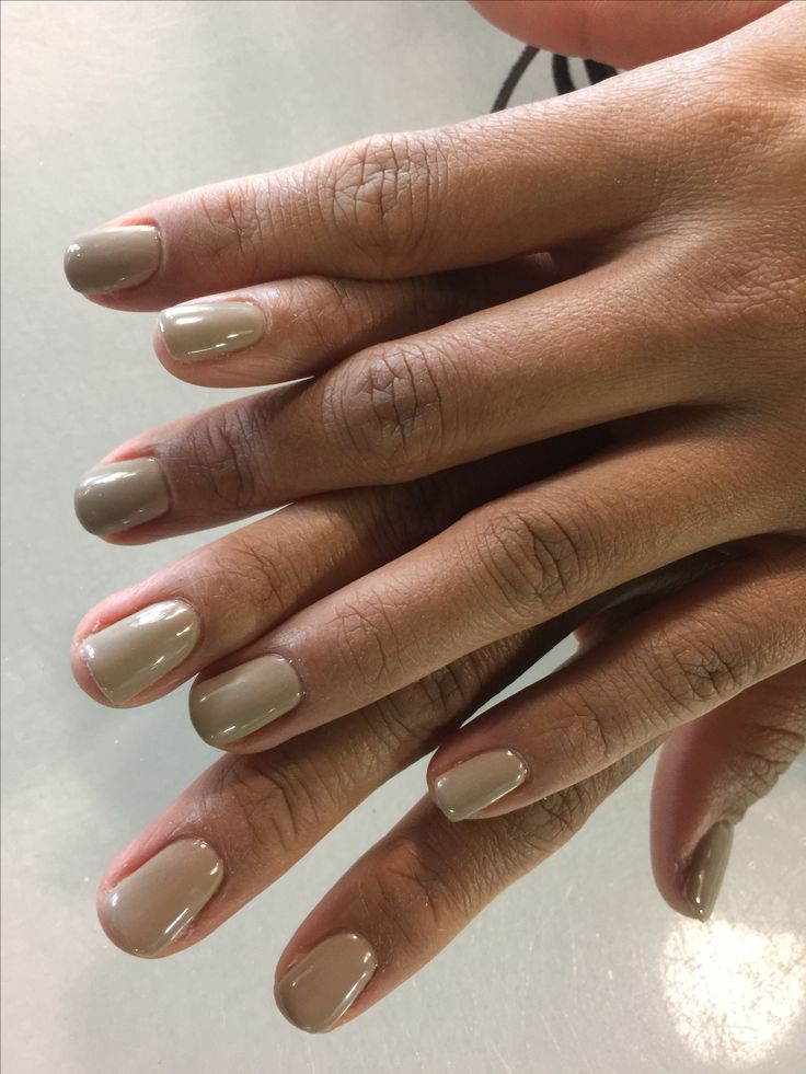
Which Color Season Is Creamy Nude Best For?
Because this shade is distinctly warm and rich, the season dynamics flip completely from the last color:The Absolute Best Match: Autumn (Soft & True) & Light Spring: This is a holy grail neutral for Soft Autumns and True Autumns because of its rich, golden-earthy undertone. It also works beautifully as a grounding, deeper nude for a Light Spring palette, as it matches the inherent warmth of the skin beautifully without looking chalky or gray.
This is the ultimate “cozy sweater weather” nude if you have a beautifully warm or neutral-warm complexion!
Mushroom Taupe
This is a beautiful, sophisticated mushroom taupe or creamy greige. It is a soft, muted neutral that perfectly bridges the gap between beige and gray, featuring subtle, warm undertones that keep it looking cozy rather than stony.
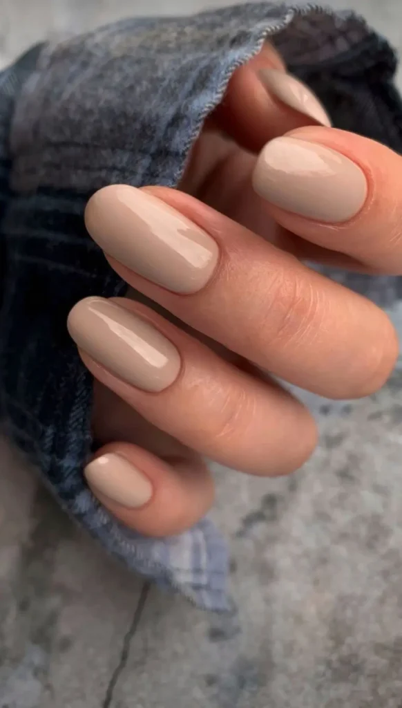
- Color Name: Mushroom / Warm Greige / Creamy Taupe
- Hex Code: Approximately #C8B9A6 (a soft, desaturated sandy gray-brown)
- Pantone Match: PANTONE 16-1107 TCX (Almond Buff) or PANTONE 15-1305 TCX (Feather Gray)
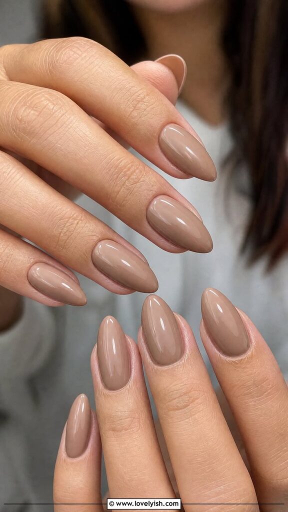
Closest OPI Nail Polish Matches
To get this exact elegant, understated look, here are the best OPI matches across different finish preferences:
- OPI “Taupe-less Beach” (Best Overall Match): This is a stunning, creamy light taupe with a soft gray-beige balance. It captures that exact “mushroom” quality without leaning too purple or too dark.
- OPI “Tickle My France-y” (For a slightly warmer, flush tone): A classic, universally flattering deep nude/greige. It has a touch more pinky-mauve undertone than the photo but gives an incredibly similar, polished chic effect on the nails.
- OPI “Put It in Neutral” (For a sheerer version): If you love the tone but want a more translucent, barely-there finish rather than a full-coverage cream, layering this cult favorite will get you very close.
- OPI “Pale to the Chief” (For a slightly lighter shade): A soft, creamy nude-beige with a hint of warmth that mimics the lighter reflections in the photo.
Choose This Colour if Your Colour Season is Summer or Spring
This precise shade of creamy mushroom greige is an absolute dream for the Summer family, but because it sits right on the cusp of warm and cool, it can also beautifully cross over into Spring.
Here is exactly how it breaks down across the color seasons:
1. The Absolute Best Match: Soft Summer
This color is a textbook Soft Summer shade. Soft Summers need colors that are muted, gentle, and desaturated, with a delicate balance of cool and warm undertones. Because this color is a true “greige” (neither stark gray nor warm tan), it mimics the soft, smoky, and elegant palette that makes Soft Summer complexions absolutely glow.
- Why it works: It feels incredibly intentional and expensive on a Soft Summer, looking like a flawless, sophisticated nude rather than a flat gray.
2. The Close Second: Light Summer & Light Spring
Because this shade is quite light and airy, it works beautifully for the “Light” sister seasons:
- Light Summer: It offers a soft, grounding neutral that isn’t as harsh or heavy as a deep espresso brown or a dark charcoal.
- Light Spring: While Light Springs generally lean toward warm, clear colors, their neutral palette relies heavily on soft, creamy almonds, pebbles, and light, warm taupes. This color has just enough creaminess to it that it won’t look lifeless or muddy on a Light Spring; instead, it reads as a clean, quiet luxury neutral.
If you are heading to a salon, asking for a creamy mushroom greige or bringing this image will get you exactly this “quiet luxury” aesthetic!
Why These Colors Work So Well in Autumn
- The Texture Match: Autumn fashion relies heavily on rich textures—think chunky cable-knits, suede, leather, and wool. Deep earthy tones and rich berry shades visually ground these heavy fabrics, making your overall look feel cohesive and carefully curated.
- Complementing the Light: The natural light in autumn becomes softer and golden. Bright neons can look harsh under autumn skies, whereas muted, rich, or desaturated tones capture that cozy, ambient warmth perfectly.
- A Shift in Mood: Nail color is an easy way to signal a change in routine. Transitioning to deeper shades reflects the collective desire to slow down, get cozy, and embrace a more introspective, comforting season.
Skittle Nails for Autumn
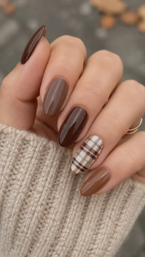
Fall Art Nails with Halloween Details

Gold Outline Fall Nails
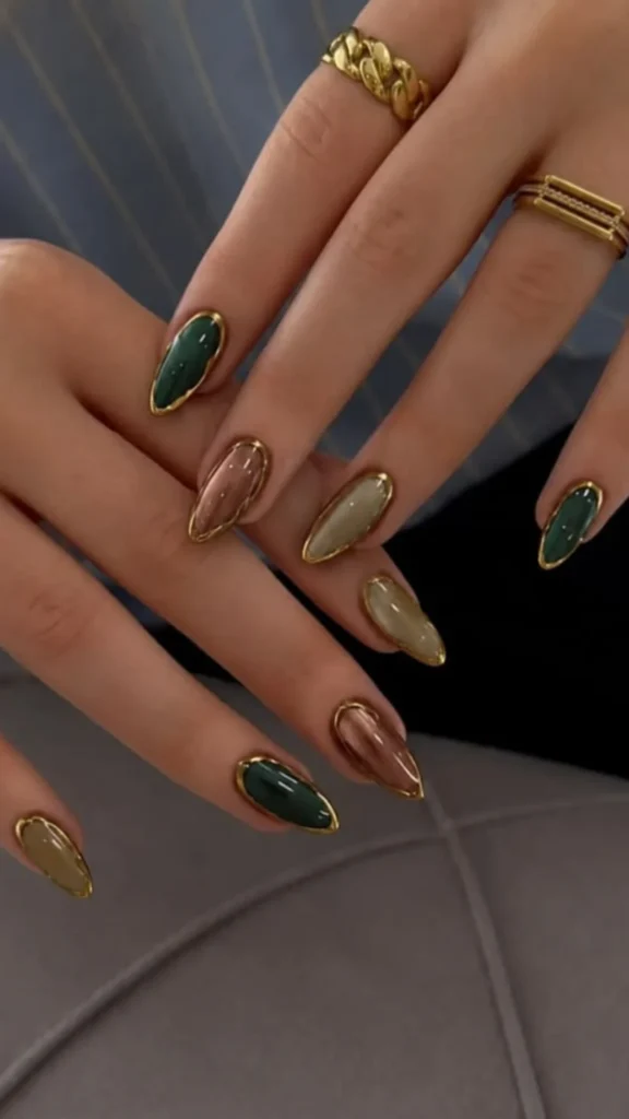
Autumn is the ideal season to transition your manicure from bright, airy summer pastels to richer, more grounded, and comforting tones. Whether you choose the luxurious high-fashion minimalism of Bitter Espresso Brown, the timeless and confident drama of Deep Bordeaux, the cozy and approachable warmth of Toffee Caramel, or the understated, quiet-luxury elegance of Mushroom Taupe, these shades perfectly mirror the natural landscape and heavy textures of the season.
By matching your autumn nail colors to your specific seasonal color palette and wardrobe fabrics, you can create a cohesive, polished look that effortlessly celebrates the cozy transition into cooler weather.